An essential aspect of user experience is the ability to anticipate and address potential issues effectively. Consider a scenario where a user loses their Internet connection while using your app. Without proper notification, this can lead to confusion and adversely affect their perception of your app’s reliability. Promptly notifying them about such connectivity issues can significantly enhance their experience.
Implementing an ‘Empty State’ is crucial in these situations. These are informative screens designed to communicate specific scenarios, such as a lost connection or encountering an empty page, thereby keeping the user well-informed.
This article offers a quick and straightforward guide on integrating an Empty State into your .NET MAUI application, ensuring a more intuitive and user-friendly interface. 🚀
🗒 Before diving in, here are some guidelines to enhance your experience while reproducing the UI:
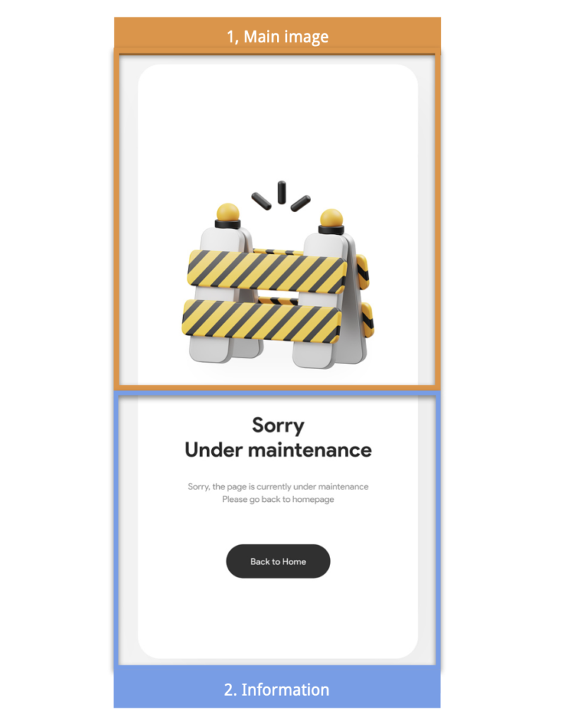
▪ Reference Image: Initially, you’ll encounter an image displaying the original UI. This image is segmented into blocks, mirroring how we’ll approach each design element.
▪ Design Blocks: Every block features a specific design element we’ll focus on. These elements are accentuated within a highlighted box.
▪ Code Annotations: Within the coding sections, lookout for comments stating, “Insert the following code here.” These comments signal that the upcoming code explanation corresponds directly to that marked location.”
Let’s start!
Breaking Down the Original Design into Blocks
For clarity and a structured approach, I’ve segmented the original design into specific blocks. We’ll tackle each block in the sequence presented below:

⚠ This article’s ‘Empty State’ design is inspired by a Dribbble example.


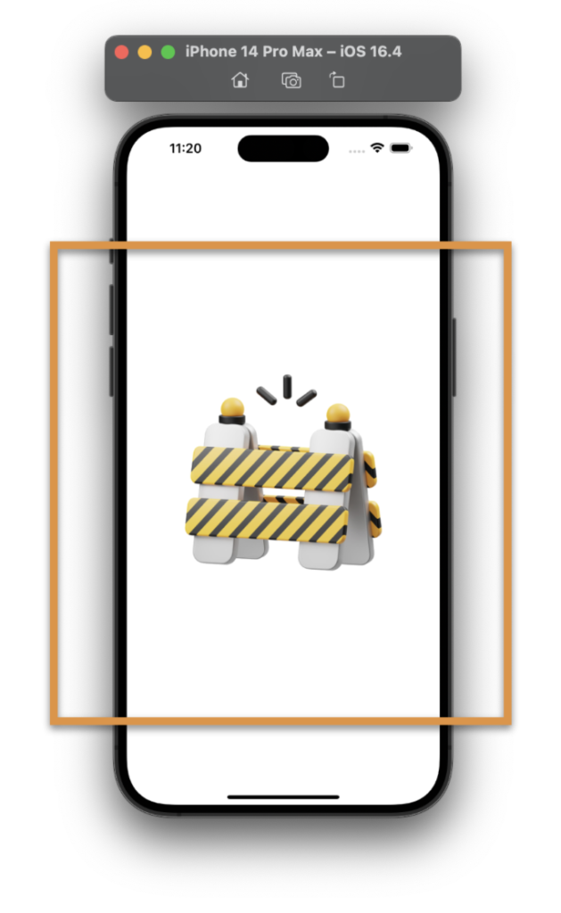
To effectively arrange our visual components, we’ll utilize a VerticalStackLayout as the primary layout structure. The first element we’ll incorporate is the main image, which we will add as follows:


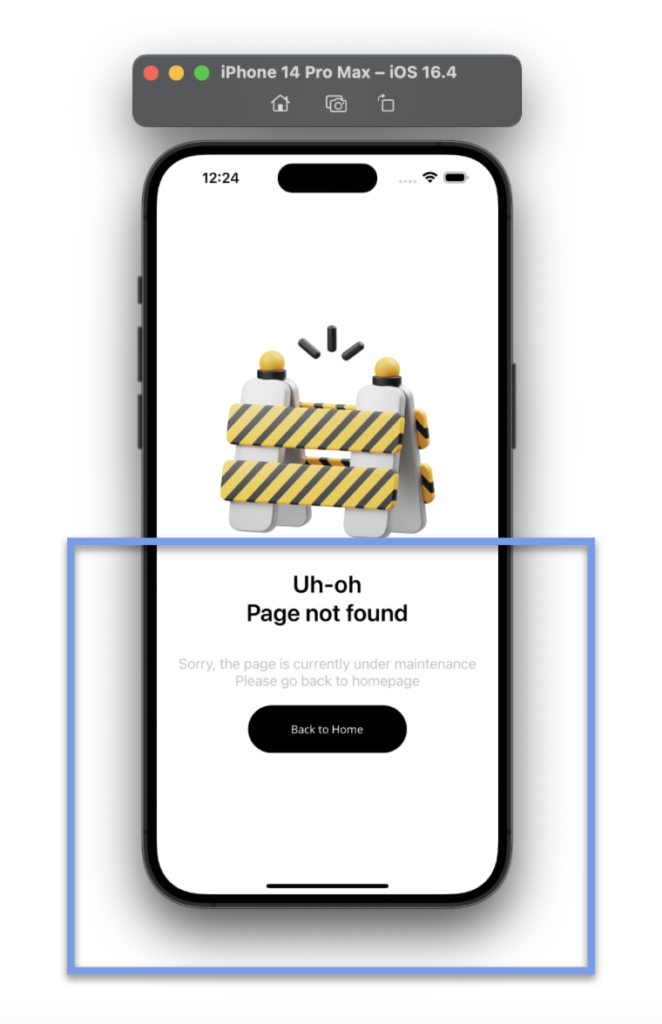
In the final step, we will introduce two key elements to our layout:
➖ Title and Description:
You might initially consider adding two separate labels, stacked on top of each other. However, I’d like us to explore the use of FormattedString as an alternative approach. FormattedString enables you to apply style variations within a single tag.
Additionally, you’ll notice a combination of characters in the code , which is used to insert line breaks into the text.
➖ Back to Home Button: Let’s incorporate a button that will allow the user to return to the beginning.
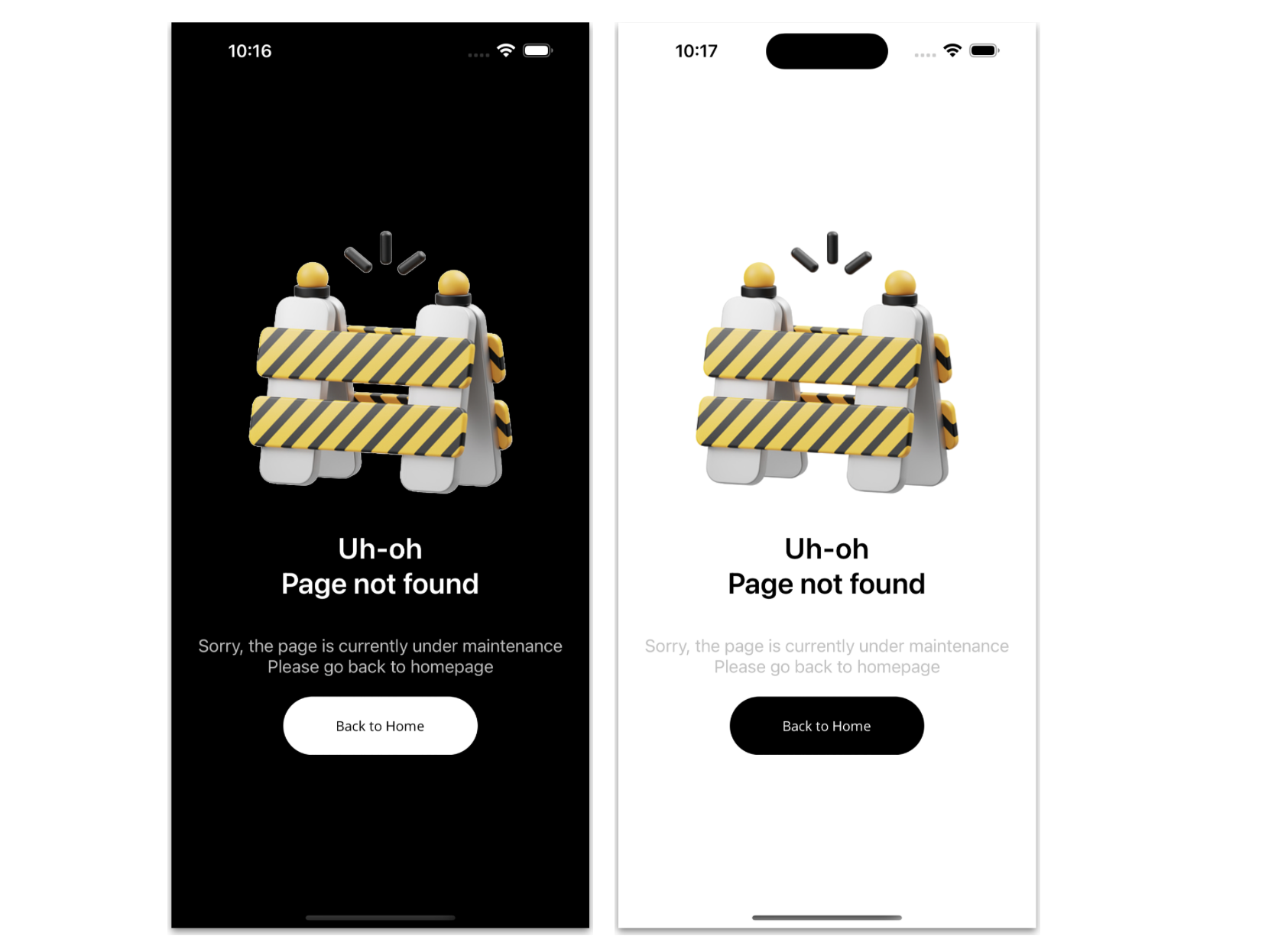
And our Empty StateUI is done! 
Thanks for ready! 👋 See you next time! 💚💕
Spanish article: https://es.askxammy.com/creando-un-empty-state-en-net-maui/


2 thoughts on “Creating Empty State for you .NET MAUI Apps”