
CollectionView allows us display a list of data. It’s very similar to the ListView but this control enhances the performance and memory management of the list and covers different layout presentations such as: Vertical, horizontal and grid, making it a lot better and saving us our precious development time. This control is available from the version of Xamarin Forms 4.0.
In this post, we will learn the following topics:
➖ What do I need to do to start
➖ Layout types
➖ Vertical and Horizontal lists
➖ Vertical and Horizontal Grids
➖ Handling an empty CollectionView
Having it clear… What do I need to start? ?
First of all, let me tell you that CollectionView in an Experimental view, that’s why we need to put it available both Android and IOS. Just adding the following code just before calling Forms.Init() in your MainActivity.cs and in your AppDelegate.cs.
A quick reminder of what is an Experimental preview!

A experimental preview, as their name suggests, are functions or libraries from preview versions of Xamarin.Forms available for experimental purposes and you need to indicate that you want to enable it. If you want to know more information about it, you can enter here.
Let’s start!!!
Layout Types
CollectionView provide to us different layout that allows us to display the data in a funnier way! Let’s know one by one!
Vertical and Horizontal lists
➖Knowing the structure
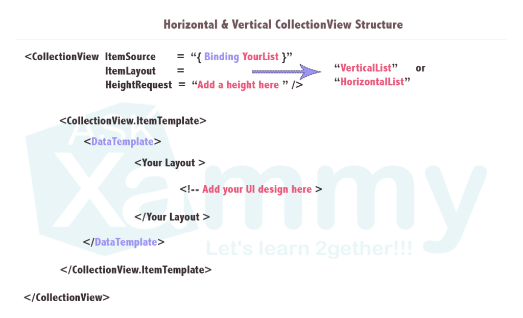
As we showed above, both horizontal and vertical list, used the same structure, you just must to specify in the ItemLayout property which one do you want to implement.
⚠ It’s very important to always add the HeightRequest property because if we do not, the CollectionView will not be visible on the screen.
➖Let’s create an example
To create it and every example in this post, I used the MVVM pattern to fill the control with data. You can see more information about this topics here.


Vertical and Horizontal Grids
➖Know the structure
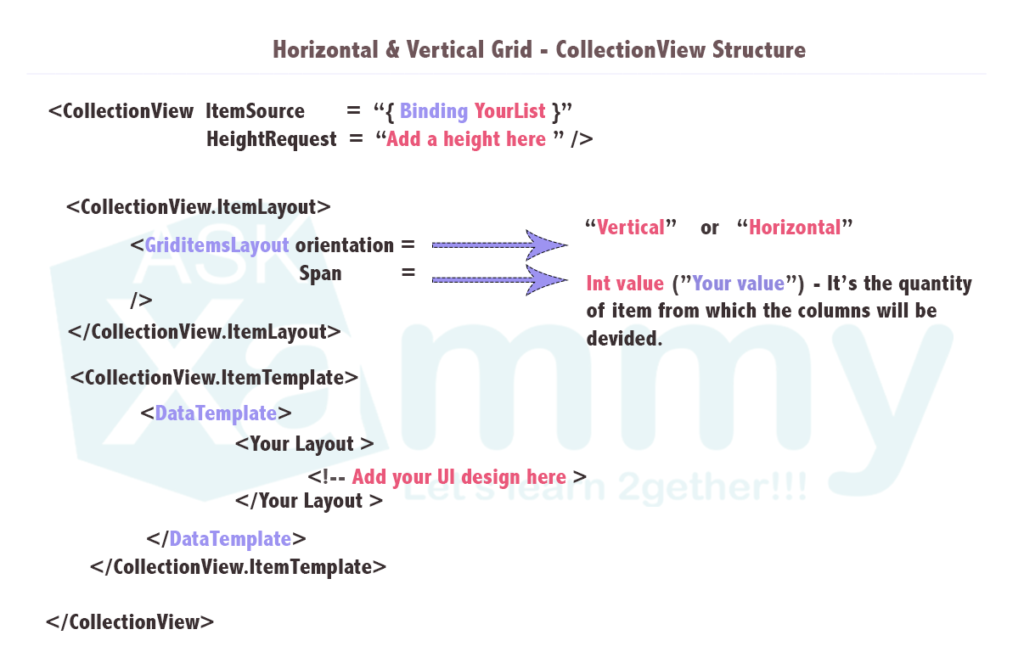
➖Let’s create an example

Handling an empty CollectionView
We can encounter the event that our CollectionView does not have any data available, so it’s good to handle this so that our users are always kept visually informed of what’s happening in our application. We can two way to do it! Let’s learn!
1⃣ We get it just adding the EmptyView property in our Collection View declaration. It receives a String value.
2⃣. To your CollectionView normal structure add <CollectionView.EmptyView>

And voila!!! ? Our CollectionView is implemented!
Thanks for reading  !!!
!!!
Spanish post: https://medium.com/@reyes.leomaris/conociendo-los-layout-del-collectionview-7e7a74483dcd


do you know how to click on collectionView’s item for display details’s item
Yes! You can do it with RelativeSource Binding:
https://javiersuarezruiz.wordpress.com/2019/09/23/xamarin-forms-relativesource-binding/