Knowing how to organize the visual elements on our screen will help us create more friendly, flexible interfaces and, above all, using the least amount of resources. For this reason, today we will quickly learn how to organize the visual elements on the Z axis in .NET MAUI applications.
But surely you are wondering what the Z axis is…🤔 since we usually know the X and Y axes. It is the space axis, which is vertical with respect to the background and directed up and down from the point of user view.
Let’s start!
How does it works?
.NET MAUI has the ZIndex property that allows us to basically manage the “depth” order with which we can display our images on the screen.
Currently, if your elements don’t have this property, they will be added to your screen in the order you add them at the code level (keeping in mind that the element that takes the largest number of depth is the last one), while with ZIndex you can break this command to directly tell you the depth setting you want. This organization of visual elements will be made from highest to lowest, that is, the highest number you assign is the one that will appear on top, while the lowest will go below.
Let’s understand graphically
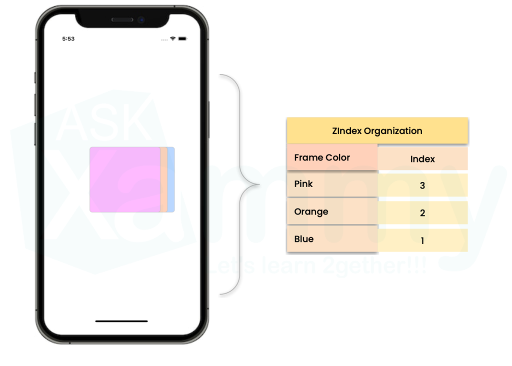
With ZIndex
In the image shown above, the Front Frame is the pink one because it has the highest ZIndex, while the Bottom Frame is the one with the lowest ZIndex.

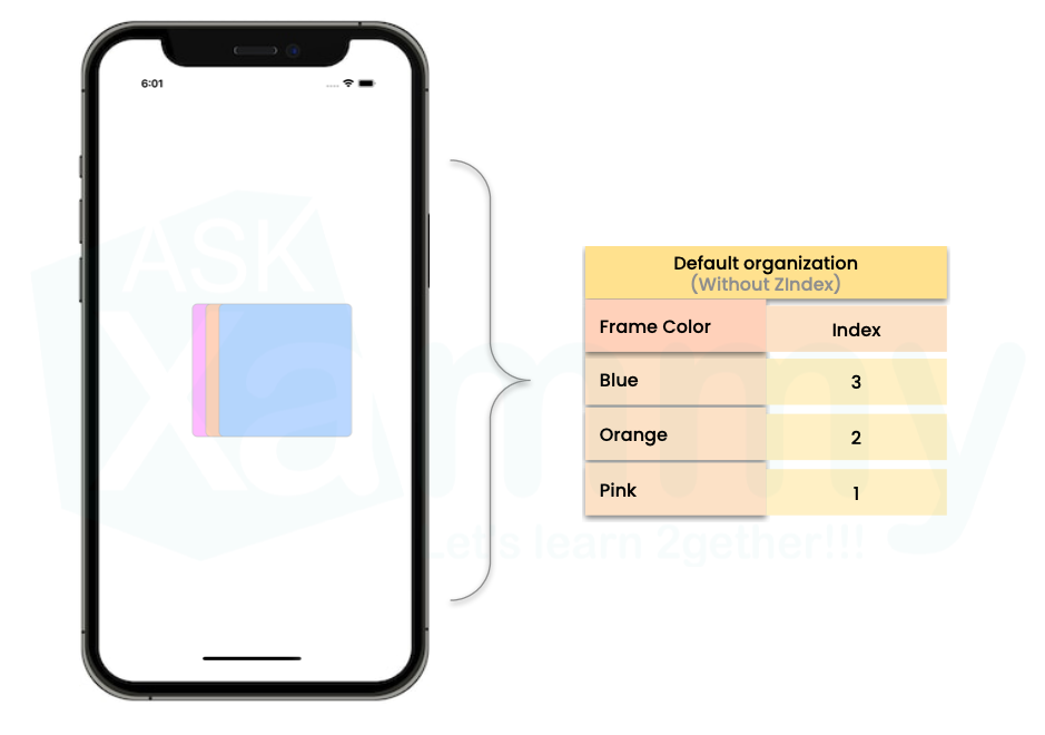
Without ZIndex property
Whereas if we don’t add the ZIndex to it, the elements are displayed on the screen in the same depth order as they are added in the code. That is, the blue Frame is the one that appears in the first “depth layer” because it has the highest ZIndex because it was the last one added.


3 thoughts on “Organizing elements with ZIndex in .NET MAUI”