Before starting, to get the best out of the post, I’ll leave you some instructional notes so that you have a better experience reproducing the UI:
Let’s start!
Let’s divide the original design into blocks
To better understand, I have divided the original design into blocks, which are listed in the order in which we will be reproducing each one, these are:

Setting a Background Color
Let’s start! The first step that you have to do is to add a BackgroundColor
to your page! In this case, let’s add it in the ContentPage
.
<ContentPage xmlns="http://xamarin.com/schemas/2014/forms" | |
xmlns:x="http://schemas.microsoft.com/winfx/2009/xaml" | |
x:Class="BoardingPassUI.MainPage" | |
BackgroundColor="{StaticResource MainColor}"> | |
<!-- Here add the code that is being explained in all the blocks --> | |
</ContentPage> |
Here use a Resource
as a Color
, It’s a good tip for code centralization! So you can change the color in the configuration as many times as you want, changing it from a single place in the App.xaml file!
<Color x:Key="MainColor">#e42525</Color> |
I leave you this documentation for more details.
Establishing the Main layout
First of all, it’s important to define the “parent” layout that we will be using! In this case, I will use a Grid!
If you want to know more information about Grid, you can enter here.
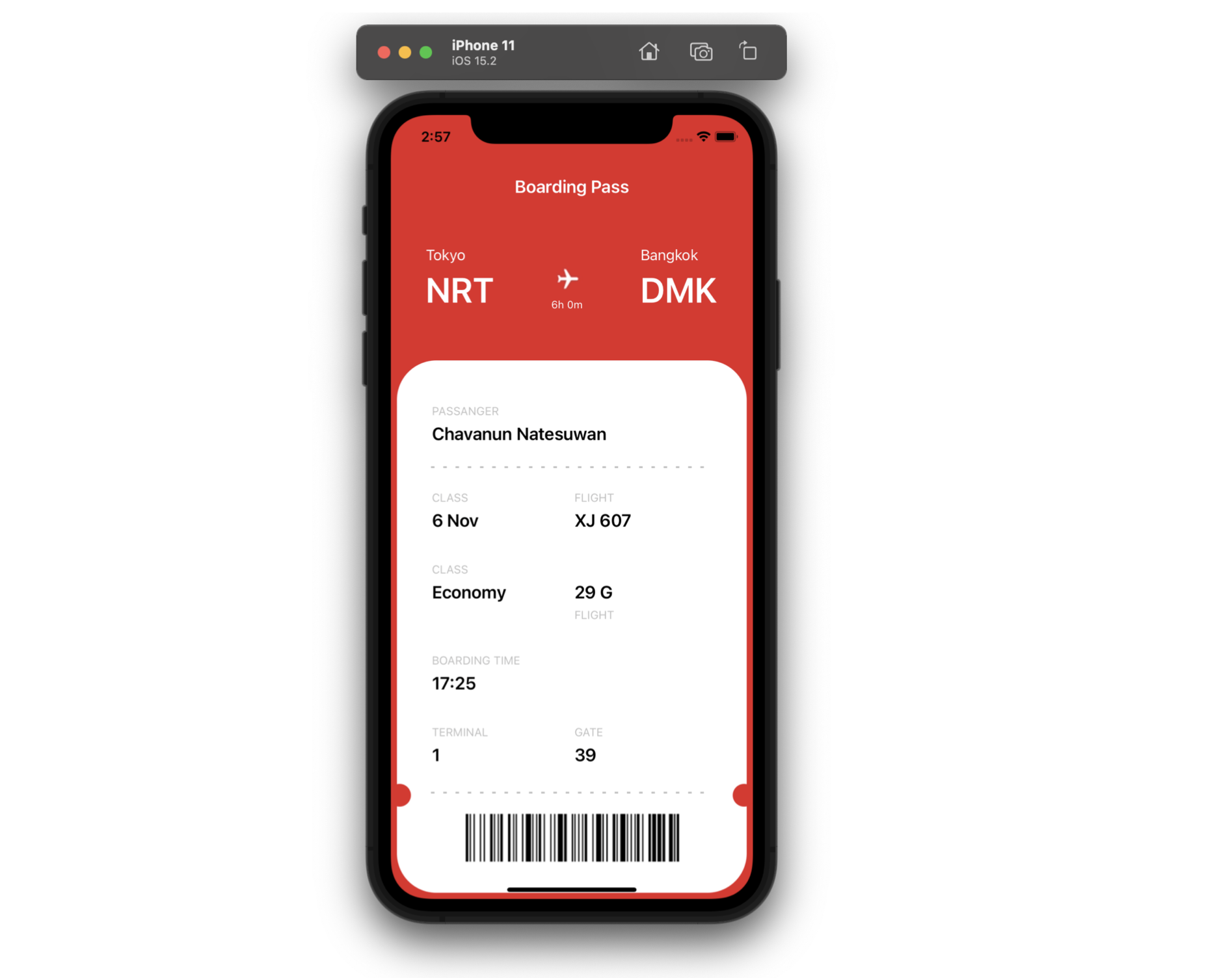
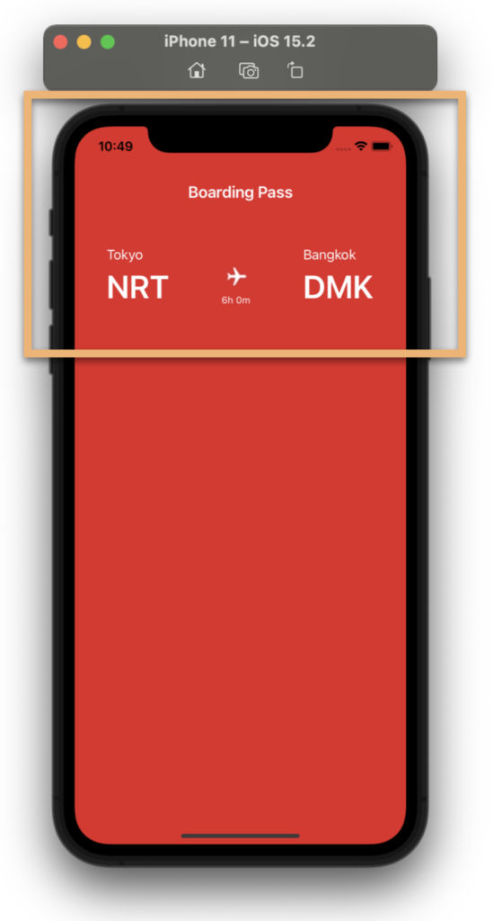
This file contains bidirectional Unicode text that may be interpreted or compiled differently than what appears below. To review, open the file in an editor that reveals hidden Unicode characters.
Learn more about bidirectional Unicode characters
<!--Main layout-->
<Grid RowDefinitions="Auto,Auto,Auto,*" ColumnDefinitions="Auto,*,Auto" Padding="40,70,40,7">
<!-- Here add the code that is being explained in all the blocks (starting with Block 1)-->
</Grid>
<!--Main layout--> | |
<Grid RowDefinitions="Auto,Auto,Auto,*" ColumnDefinitions="Auto,*,Auto" Padding="40,70,40,7"> | |
<!-- Here add the code that is being explained in all the blocks (starting with Block 1)--> | |
</Grid> |
Let’s start with the “Boarding Main Information” Block
This block is composed of three columns which contain the information of the destination countries of the flight! Let’s see how to pass it to code!
<!-- Boarding Main Information --> | |
<!-- Boarding: Main title --> | |
<Label Grid.Row="0" Grid.Column="0" Grid.ColumnSpan="3" HorizontalTextAlignment="Center" FontSize="20" FontAttributes="Bold" TextColor="White" Text="Boarding Pass" Margin="0,0,0,50"/> | |
<!-- Boarding: Round trip countries --> | |
<Label Grid.Row="1" Grid.Column="0" Text="Tokyo" Style="{StaticResource CountryTitle}" /> | |
<Label Grid.Row="2" Grid.Column="0" Text="NRT" Style="{StaticResource AirportName}" /> | |
<Image Grid.Row="1" Grid.Column="1" Grid.RowSpan="2" Source="Airplane" WidthRequest="50" HeightRequest="50" HorizontalOptions="Center"/> | |
<Label Grid.Row="2" Grid.Column="1" Text="6h 0m" FontSize="12" TextColor="White" VerticalOptions="End" HorizontalOptions="Center" /> | |
<Label Grid.Row="1" Grid.Column="2" Text="Bangkok" Style="{StaticResource CountryTitle}"/> | |
<Label Grid.Row="2" Grid.Column="2" Text="DMK" Style="{StaticResource AirportName}" /> |
So that you can also explore the styles a bit, in this UI development, we will be working with them! (As you can see in the code block above). Below, I leave you the implementation of each of them.
If you want to know more information about styles, you can enter here.
<Style x:Key="CountryName" TargetType="Label"> | |
<Setter Property="HorizontalOptions" Value="Start"/> | |
<Setter Property="TextColor" Value="White"/> | |
</Style> | |
<Style x:Key="AirportName" TargetType="Label"> | |
<Setter Property="HorizontalOptions" Value="Start"/> | |
<Setter Property="FontSize" Value="40"/> | |
<Setter Property="TextColor" Value="White"/> | |
<Setter Property="FontAttributes" Value="Bold"/> | |
</Style> |
For this second block, we will only add a Frame that will contain all the details of our Ticket!
<!-- 2. Ticket Frame --> | |
<Frame Grid.Row="3" Grid.Column="0" Grid.ColumnSpan="3" BackgroundColor="White" CornerRadius="45" HasShadow="False" Margin="-33,50,-33,0"> | |
<Grid ColumnDefinitions="*,*" RowDefinitions="Auto,Auto,Auto,Auto,Auto,Auto,Auto,Auto,Auto,Auto,Auto,Auto,Auto,Auto" Padding="20,0,20,5"> | |
<!-- Here add the code that is being explained in the next block --> | |
</Grid> | |
</Frame> |
For the next block, we are going to prepare the styles that we will be using for the Titles and the values of each Ticket data! We will take the opportunity to advance it!
<Style x:Key="TicketTitle" TargetType="Label"> | |
<Setter Property="FontSize" Value="13"/> | |
<Setter Property="Padding" Value="0,30,0,0"/> | |
<Setter Property="TextColor" Value="Silver"/> | |
</Style> | |
<Style x:Key="TicketDescription" TargetType="Label"> | |
<Setter Property="FontSize" Value="20"/> | |
<Setter Property="FontAttributes" Value="Bold"/> | |
</Style> |

Let’s divide this block into sub-blocks to be able to detail the step by step of each line of code!
Starting with the basic information of the person
<!-- Basic information--> | |
<Label Grid.Row="0" Grid.Column="0" Text="PASSANGER" Style="{StaticResource TicketTitle}"/> | |
<Label Grid.Row="1" Grid.Column="0" Grid.ColumnSpan="2" Text="Chavanun Natesuwan" Style="{StaticResource TicketDescription}"/> |
Main Flight information
<!-- Main Flight information--> | |
<Label Grid.Row="3" Grid.Column="0" Text="CLASS" Style="{StaticResource TicketTitle}"/> | |
<Label Grid.Row="4" Grid.Column="0" Text="6 Nov" Style="{StaticResource TicketDescription}"/> | |
<Label Grid.Row="3" Grid.Column="1" Text="FLIGHT" Style="{StaticResource TicketTitle}"/> | |
<Label Grid.Row="4" Grid.Column="1" Text="XJ 607" Style="{StaticResource TicketDescription}"/> | |
<Label Grid.Row="5" Grid.Column="0" Text="CLASS" Style="{StaticResource TicketTitle}"/> | |
<Label Grid.Row="6" Grid.Column="0" Text="Economy" Style="{StaticResource TicketDescription}"/> | |
<Label Grid.Row="6" Grid.Column="1" Text="FLIGHT" Style="{StaticResource TicketTitle}"/> | |
<Label Grid.Row="6" Grid.Column="1" Text="29 G" Style="{StaticResource TicketDescription}"/> | |
<Label Grid.Row="7" Grid.Column="0" Text="BOARDING TIME" Style="{StaticResource TicketTitle}"/> | |
<Label Grid.Row="8" Grid.Column="0" Text="17:25" Style="{StaticResource TicketDescription}"/> | |
<Label Grid.Row="9" Grid.Column="0" Text="TERMINAL" Style="{StaticResource TicketTitle}"/> | |
<Label Grid.Row="10" Grid.Column="0" Text="1" Style="{StaticResource TicketDescription}"/> | |
<Label Grid.Row="9" Grid.Column="1" Text="GATE" Style="{StaticResource TicketTitle}"/> | |
<Label Grid.Row="10" Grid.Column="1" Text="39" Style="{StaticResource TicketDescription}"/> | |
<Line Grid.Row="11" Grid.Column="0" Grid.ColumnSpan="2" Style="{StaticResource DivisionLine}" Margin="0,-30,0,0" /> |
Above we added the flight information, I want to stop you to take a closer look at the creation of the dividing line! (You can identify it by Line
in the previous code) For this, I created a style and used a Shape to achieve it!
<Style x:Key="DivisionLine" TargetType="Line"> | |
<Setter Property="TranslationY" Value="{OnPlatform Android='15', iOS='20'}"/> | |
<Setter Property="VerticalOptions" Value="Center"/> | |
<Setter Property="HorizontalOptions" Value="Center"/> | |
<Setter Property="StrokeDashArray" Value="1,6"/> | |
<Setter Property="X2" Value="320"/> | |
<Setter Property="StrokeLineCap" Value="Square"/> | |
<Setter Property="Stroke" Value="Silver"/> | |
<Setter Property="StrokeThickness" Value="2"/> | |
</Style> |
Do you see those holes that the Frame has?
To give the feeling that the Frame is “cut like a ticket”, I used two Ellipses and I played with the color fill, adding just the same color as the background page! Let’s see!
<!--Boarding: Circles--> | |
<Ellipse Grid.Row="11" Grid.Column="0" HorizontalOptions="Start" Margin="-50,15,0,0" Fill="#e42525" VerticalOptions="End" HeightRequest="26" WidthRequest="26" StrokeThickness="0"/> | |
<Ellipse Grid.Row="11" Grid.Column="1" HorizontalOptions="End" Margin="0,15,-50,0" Fill="#e42525" VerticalOptions="End" HeightRequest="26" WidthRequest="26" StrokeThickness="0"/> |
Finally, I added an image to simulate the Barcode. If you want to know how to generate a Barcode, I leave you this article in which Gerald Versluis teaches you how to do it!
<!--Barcode image--> | |
<Image Grid.Row="12" Grid.Column="0" Grid.ColumnSpan="2" Source="Codebar"/> |
