

Hello! 🙋♀️ In this article, we’ll replicate an E-Book Onboarding UI, a design sourced from Dribbble. This piece will help you strengthen your skills in managing XAML in a quick and easy way. The most fun part is that you’ll learn to build it yourself! 😍
Explanation Insights
🗒 Before diving in, here are some guidelines to enhance your experience while replicating the UI:
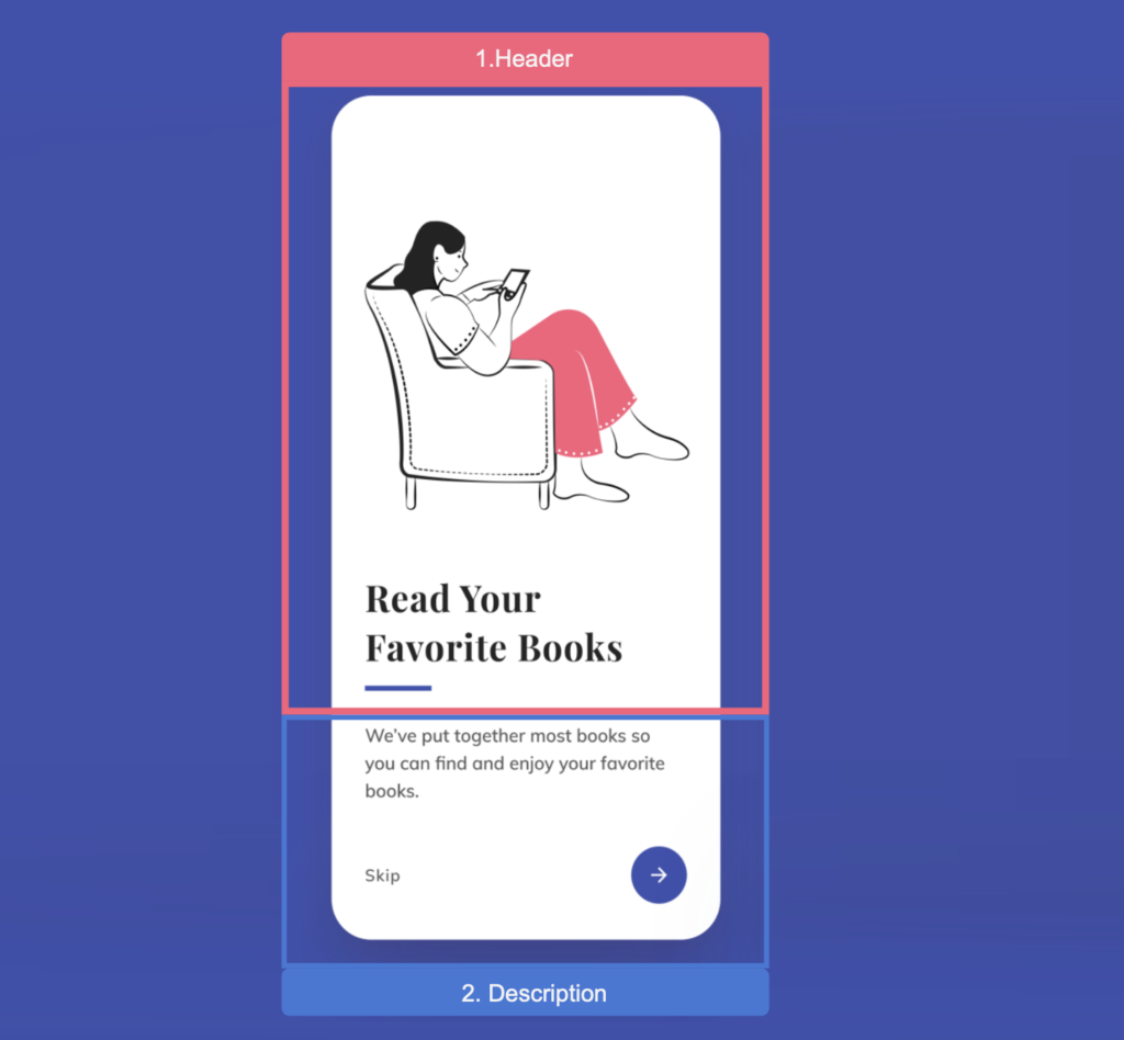
▪ Reference Image: Initially, you’ll encounter an image displaying the original UI. This image is segmented into blocks, mirroring how we’ll approach each design element.
▪ Design Blocks: Every block features a specific design element we’ll focus on. These elements are accentuated within a highlighted box.
▪ Code Annotations: Within the coding sections, lookout for comments stating, “Insert the following code here.” These comments signal that the upcoming code explanation corresponds directly to that marked location.
Let’s start!
Breaking Down the Original Design into Blocks
For clarity and a structured approach, I’ve segmented the original design into specific blocks. We’ll tackle each block in the sequence presented below:
Main structure
In this case, we want to keep the same colors for both light and dark mode, let’s start by adding a white background color to the ContentPage.
If you want to know more information about Grid, I invite you to read the articles working with GridLayout and latest Grid structure.

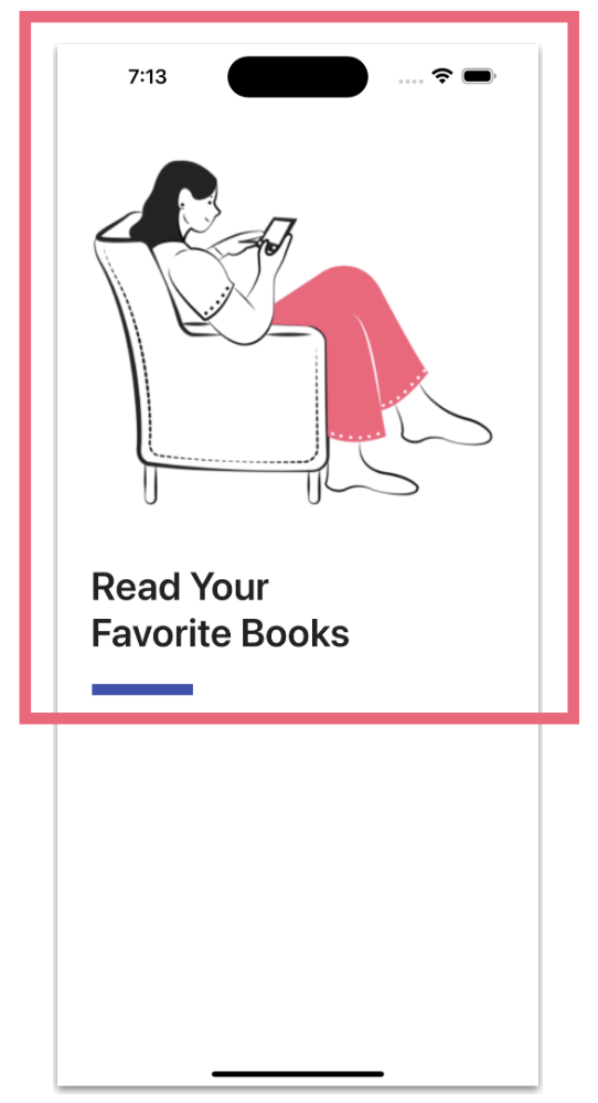
Let’s start by developing the first step, which includes three elements: a main image, a title, and a blue decorative bar. We are going to add the code progressively. To know exactly where to insert it, reference the code block above marked “<!– Insert Step 1 code here –>”.
Now let’s explore how to add each UI element:
🔹 Main image
🔹 Title
For the title we will use the default font. However, if you want to learn how to add external text fonts, I recommend the article “Adding Fonts in .NET MAUI”.
💡 If you’re wondering about the idea of using an external font but are having trouble identifying the font name, don’t worry! WhatTheFont can help you. Just upload a screenshot of your UI and it will identify the source for you. 😎
✍️ Have you noticed the presence of these characters ‘ ’ in the text? They serve a purpose. You can use them when you want to insert a line break in the text.
🔹 Blue bar
To conclude this first step, let’s add the blue bar found in our design. You can create it using BoxView or Line Shape. In this case, we will use the Line Shape.

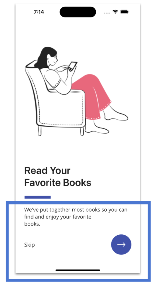
Continuing with step two, we have three elements: a description for clarity, a skip option, and a rounded button. Let’s see how to add them to the code:
🔹 Description & skip
🔹 Rounded button
Creating a rounded button is easy! Just add the HeightRequest and WidthRequest properties with the same value, then add the CornerRadius property with a value that’s exactly half of the previous one. For more on circular buttons, check out the article “Easy way to create circle buttons”.
And our E-Book onboarding screen is done! 
To see the complete code structure, you can enter my Github repository 
Thanks for reading! 👋 See you next time! 💚💕
Spanish article: https://es.askxammy.com/creando-un-e-book-onboarding-ui-en-net-maui/
