Howdy!!! 

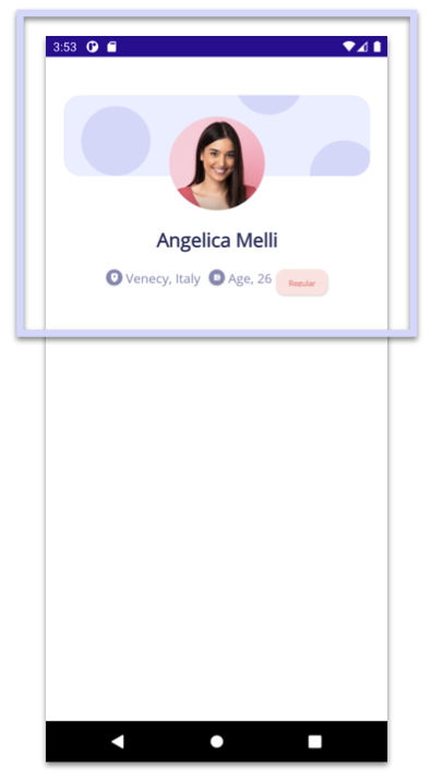
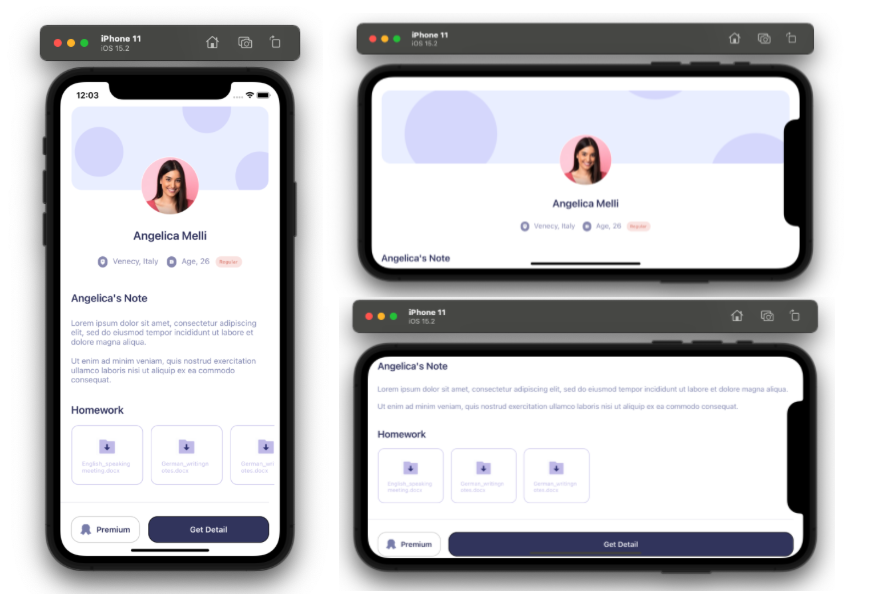
 At the beginning, you will see an image with the original UI where you will see divided into blocks as we’ll be working on each part of the design.
 Each block presents the image with the design explicitly that we’ll be working on that block, they are highlighted in a box.
 In each of the code blocks, you can see a comment that says: “Here add the code that is being explained in the next block“. To keep you as focused as possible, this part indicates to you that the next block code explanation goes right where the comment line is added.
Let’s start!
Let’s divide the original design into blocks
To better understand, I have divided the original design into blocks, which are listed in the order in which we will be reproducing each one, these are:


💥 Starting establishing the Main layout
As the main Layout of our screen we will be using the Grid! 😎 Yes, the Grid is already available in .NET MAUI and has the same structure, if you don’t know how to use the Grid you can access the article Working with Grid”.
But in addition, everything will be inside a ScrollView, this will allow users to scroll through our App, and that also will be available in a Horizontal Orientation! 💚
 💥 Let’s start with the components of the first block
To start the first block, I will detail each component that makes our design a reality, let’s see!
- Timeline: This image will work as the background of the profile image (which we will see in the next step), this image has rounded edges, to do it we will add it inside a Frame and will be using the CornerRadius property!
- Profile image: In this case, the profile image will have a circular shape, to do so we will also use a Frame. Also, to achieve the overlapping look, we’ll play with the Frame’s Margin property where we’ll add a negative value for the top value. (
Margin="0,-90,0,0")
- Profile name and general description:
The first block is complete! 🤓

 In this second block, we will work with the Title and Description Labels.
The second block is complete! 🤓

 I love this final block because it complements the design of this beautiful user interface! 😍 This block is made up of several elements, so, just like the first block, we are going to detail each of the components accompanied by their explanation!
- Title and task list: We will add the Homework title and we will also use a CollectionView to add the list.
- Dividing line and buttons: For the dividing line we use a BoxView! We will also add the Get Detail and Premium buttons.
The third block is complete! 🤓
 .
.


HI, my name is Chiao,from TAIWAN
I want to tell u ,your blog is really clear and helpful~~
Thank for helping me to understand how to write XAMARIN
I truly appreciate all your articles on this matte.
Thanks a lot
Hi Chiao 💚 Thank you! I’m so happy to read it 🙈!!