
 In collaboration with the .NET MAUI UI July Calendar, we will be replicating the Pet Adoption UI obtained from Dribble. I hope this is useful for you! 💚
 Before starting, to get the best out of the post, I’ll leave you some instructional notes so that you have a better experience reproducing the UI:
 At the beginning, you will see an image with the original UI where you will see divided into blocks as we’ll be working on each part of the design. Each block presents the image with the design explicitly that we’ll be working on that block, they are highlighted in a box. In each of the code blocks, you can see a comment that says: “Here add the code that is being explained in the next block“. To keep you as focused as possible, this part indicates to you that the next block code explanation goes right where the comment line is added. I will not be using styles so that the properties added to the various components can be seen and understood faster in the explanation process.
Let’s start!
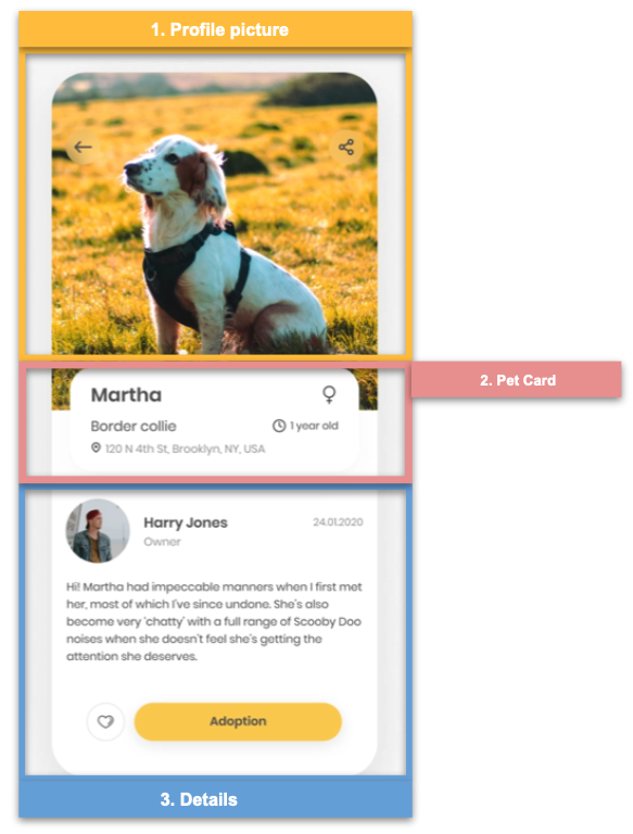
Let’s divide the original design into blocks
To better understand, I have divided the original design into blocks, which are listed in the order in which we will be reproducing each one, these are:
First, let’s define the main layout we’ll be using!
In this case, we will use a Grid to structure the screen as you can see in the following code block:
⚠ If you want to know more information about the Grid, I invite you to see this article.

 Let’s start with the Blocks!
The first one is the Profile Picture, here we just have to add the profile image of the Pet.
.
.

To begin with, we will divide this block into sub-blocks, each one of them will go with its explanation followed by its code implementation, let’s explore it:
 Frame and main Grid of the Pet Card
Let’s evaluate the goals:
✔ Rounded edges, these are the rounded edges that can be seen at the top of the image, for this we will use a Frame.
✔ Overlapping of controls, to achieve the effect of overlapping we will use the Margin property, to which in the Top value we will assign a negative value to achieve the effect of being above the image of the previous block.
Now let’s see it in code:
Let’s add the controls to the Frame
Now we will add the general information contained within the Frame, information such as main name, address, among others.

To finish, let’s continue with the last block, which is made up by the following components:
 ✔ Rounded photo, name, role and date.
✔ Description
✔ Like and adopt buttons.
 .
.

