 In this case we are going to replicate a Good Mood UI App obtained from Dribble. I hope this is use for you! 💚
 At the beginning, you will see an image with the original UI where you will see divided into blocks as we’ll be working on each part of the design.
 Each block presents the image with the design explicitly that we’ll be working on that block, they are highlighted in a box.
 In each of the code blocks, you can see a comment that says: “Here add the code that is being explained in the next block“. To keep you as focused as possible, this part indicates to you that the next block code explanation goes right where the comment line is added.
 I will not be using styles so that the properties added to the various components can be seen and understood faster in the explanation process.
Let’s start!
Let’s divide the original design into blocks
To better understand, I have divided the original design into blocks, which are listed in the order in which we will be reproducing each one, these are:


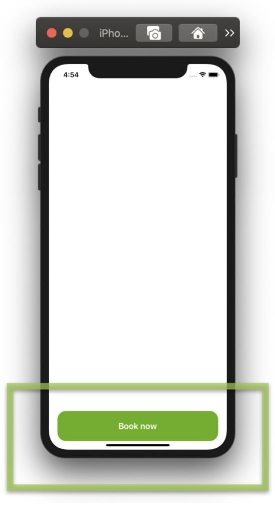
 As the first step, I want to build the floating button. To do it, I’ll use a ScrollView inside a Grid layout to get the desired effect. If you want to know more information about how to do it, you can enter here.
💡If you want to add a Shadow, you can use Xamarin Community Toolkit, check it here!

 Let’s break down some important points!
➖ Rounded Image: I used a Frame where the magic property is IsClippedToBounds, which allow us to clip its children to its bound.
Inside this one, I added the Image which must have the same value both in WidthRequest and HeightRequest properties and half of that value in the CornerRadius property, to achieve the exact rounded shape.
You can see more information here.

 Let’s continue with the Topics list, here the objective is to make it as scalable as possible using a CollectionView, in this way you can add as many Topics / tags as you need in your App without having to modify the XAML. 😎

This block requires that the information is presented with a repetitive pattern which must be divided into two columns, for this, let’s also use the CollectionView.


.
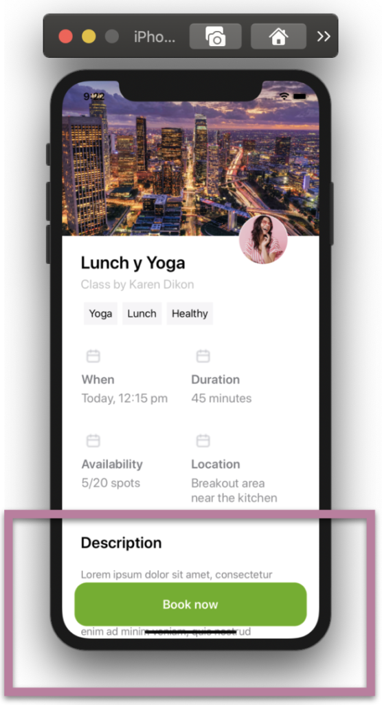
Do you remember the first step where we made the floating button? Yep! Well, in this step we are going to work on the description block and this is where we are going to see the “float” effect reflected!
.
.
.

 .
.


2 thoughts on “Replicating Good Mood UI in Xamarin Forms”