Throughout my career at Xamarin, working with XAML has been one of my main passions. 💚💕 One of the most common comments I have heard is that “I want to start creating UIs but I don’t know how to start.” And precisely for this reason, it inspired me to make this post, I want to share the tips that I use so that you can make the creation of UIs with XAML your best friend and in a very easy way! 🤓
To learn how to develop UI and not die trying, we are going to apply a “tactic” that I use that has worked very well for me! For a better understanding, we will base this topic on a real UI which will be divided into the following parts:
1⃣. Analyze the structure of our UI before the code (We will see it in this post)
2⃣. Once we understand how to get this structure, we will learn how to replicate it in XAML! (We’ll see it in our next post)
Let’s start!
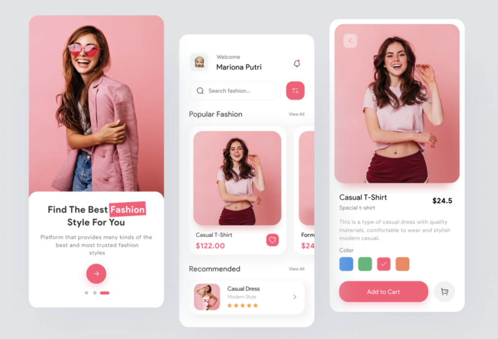
Before starting with the code, it is very important to be clear about what we are going to develop, in this way we can identify the indicated Layout for the design, so we must first analyze the UI! We will apply the explanation to our sample named Fashion Mobile App UI obtained from Dribble.

Thinking about the ideal structure for our layout
Let’s forget about writing code for a moment, we are going to focus on being able to detect the best Layouts structure so that our code is as optimal as possible, in this case, we are going to define the main structure of the first screen using a Grid, for this we must identify the number of rows and columns contained in our design. If you want to know more information about Grid, you can read this post.

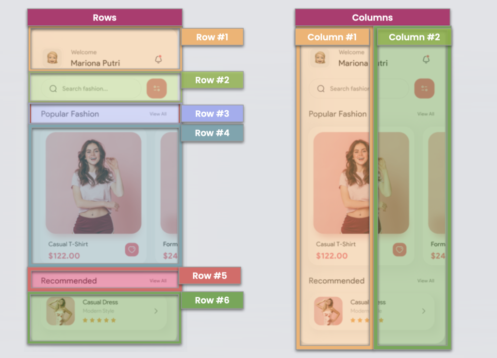
It’s easy, to identify the correct number of Rows with which we should work, just literally count the number of components in as many rows as the design contains. And it applies the same criteria to the definition of columns. (In this case, all elements are in one column)

For our second screen, we are going to do a little more complex analysis on how to identify the rows and columns for a Grid structure, we will have two screens, in the first, you will see the identified Rows and in the second you will see the columns that contain it.

And done! We already have our UI defined in Rows and Columns with which we can start to structure our App! I hope you have understood how we can make this division effective, if you have any questions let me know! You will also see in the next article how we can replicate this user interface in XAML.
Finally, I have a question for you! 🧐
How would you divide the third screen which we do not analyze here! I’ll wait for your answer! 💚
Thanks for reading! 💚💕
Spanish post: https://es.askxammy.com/no-se-como-empezar-a-crear-ui-en-xamarin-forms-que-debo-tener-en-cuenta/


Hi Leomaris,
Thanks for the post, and tackling a “beginner topic”. Just wondering how you came to decide there were two columns in the second screen. There are some elements that are side-by-side in a given row… such as the search-box and filter(?) button, but nothing appears to split the screen down the middle.
As a new-comer to Xamarin, I would have gone for a 6 row, 1 column grid, and probably then used horizontal stack layout to put the controls next to each other…
I’m guessing there’s no “one right way” but would be keen to hear you expand on why you chose the approach you did…
Hi Andrew!
Hoping you’re well! 💚 As you say, there are different ways to interpret the design!
In this case, I defined two columns based on the use of a Grid as the main layout (Helping my App performance). I split into two columns due to the repetitive majority number of controls contained in one column, which in this case is two.
Then I leave the post with the exact replica of this UI, so you can see the explanation in code https://askxammy.com/replicating-fashion-ui-in-xamarin-forms/
Hi Leomaris,
Really looking forward to this rest of this series.
Whats the purpose of the 2nd column on the 2nd Screen? It intersects all the elements in column 1, so why not just 1 column?
Regards,
Jason
Hi Jason!
Hopin you are doing well! 💚 In this case, I divided into two columns to be able to position the defined elements of my UI in the same layout (Grid). You could also do it in a column, but if we don’t use the Grid you will need to define a StackLayout with horizontal orientation for each design line that has two elements in the same column, this does not help us with performance, with the grid I can obtain the same result with less number of defined layouts.
Thanks for reading my post! Then I leave you the other post of the series!
https://askxammy.com/replicating-fashion-ui-in-xamarin-forms/