⚠ Before starting, to get the best out of the post, I’ll leave you some instructional notes so that you have a better experience reproducing the UI:
Let’s start!
Let’s divide the original design into blocks
To better understand, I have divided the original design into blocks, which are listed in the order in which we will be reproducing each one, these are:


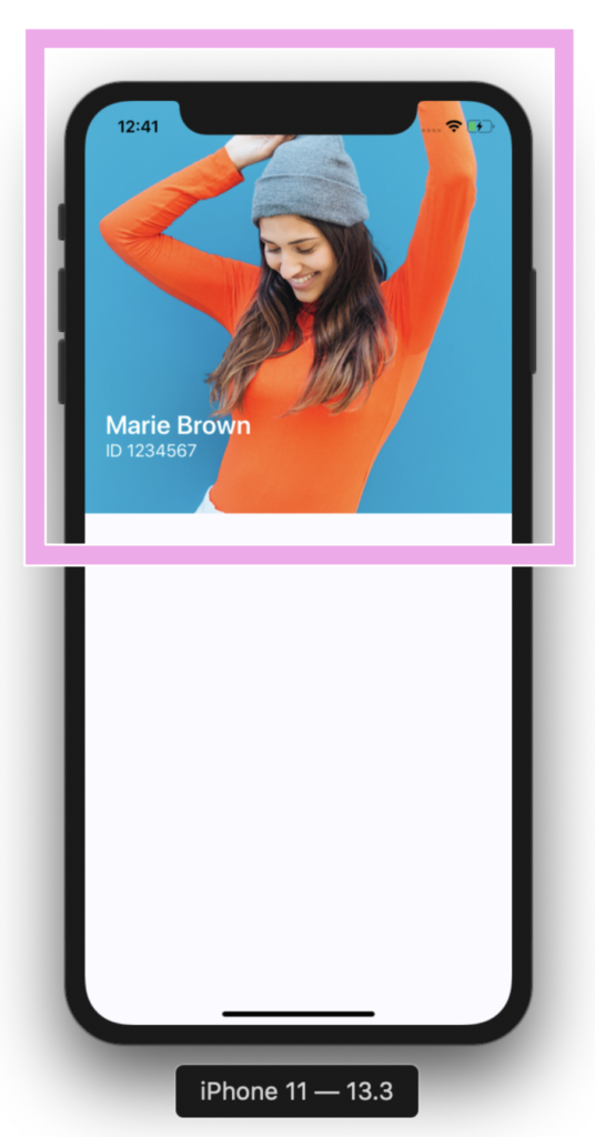


To replicate the “Contact information frame” block, we just need to add a frame to achieve the oval shapes above.

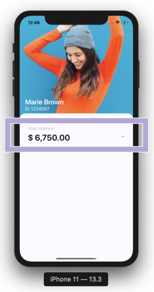
To add all this contact information we will be working with a Grid which will be contained in Two columns and six rows. Let’s start adding “Your balance” block.

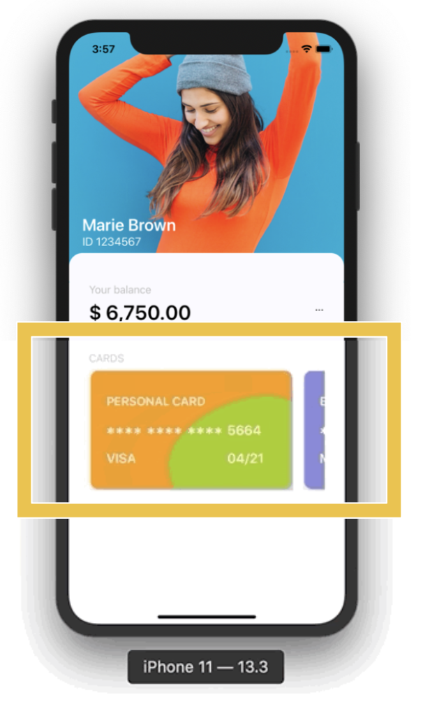
For “Cards” block we will be using a CollectionView. it’s important that the project adheres to the the MVVM Design pattern. That’s why I used text properties Binded.

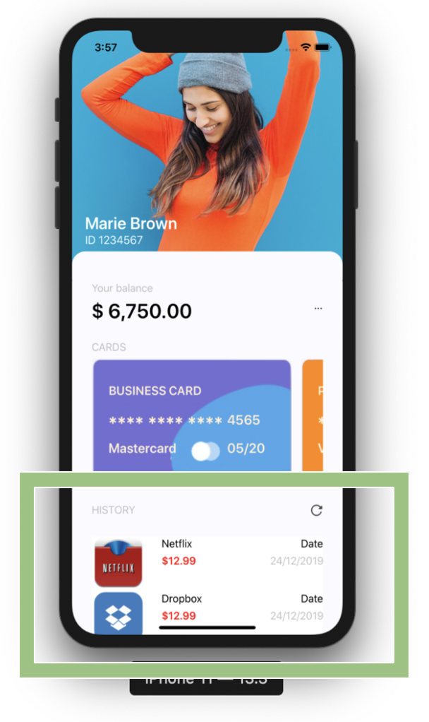
And finally I also used a CollectionView to replicate the history list.
In the main image of this post, I added some screenshot of the IOS version, now I’ll leave those of the Android one.
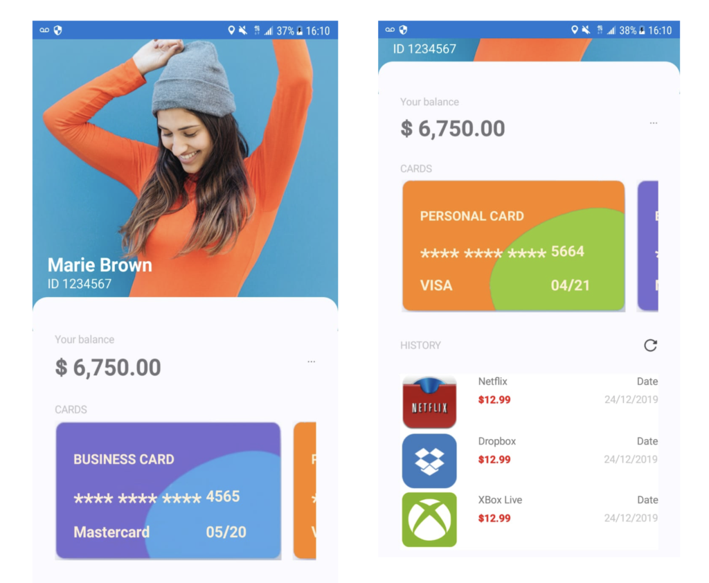
And our Banking Profile design is done! ?
 https://github.com/LeomarisReyes/BankingAppUISample
Spanish post: https://medium.com/@reyes.leomaris/replicando-ui-de-perfil-bancario-en-xamarin-forms-5bbfac0a8035
Thanks for reading!!!


I think that it would be great if banking sector started to use more Xamarin Forms.
The apps would be good looking and fast.
??
Excellent job!
Thank you! ☺️
Great article Leomaris, Thank you! I would love you write an article about reading a pdf inside a Xamarin mobile app. For example, let’s consider that I have a listview of books (pdf) and I would like when people click on any book they could stay inside the app and read the book through.
Thank you ☺️!! Okey! I’ll add this topics in my list to write!