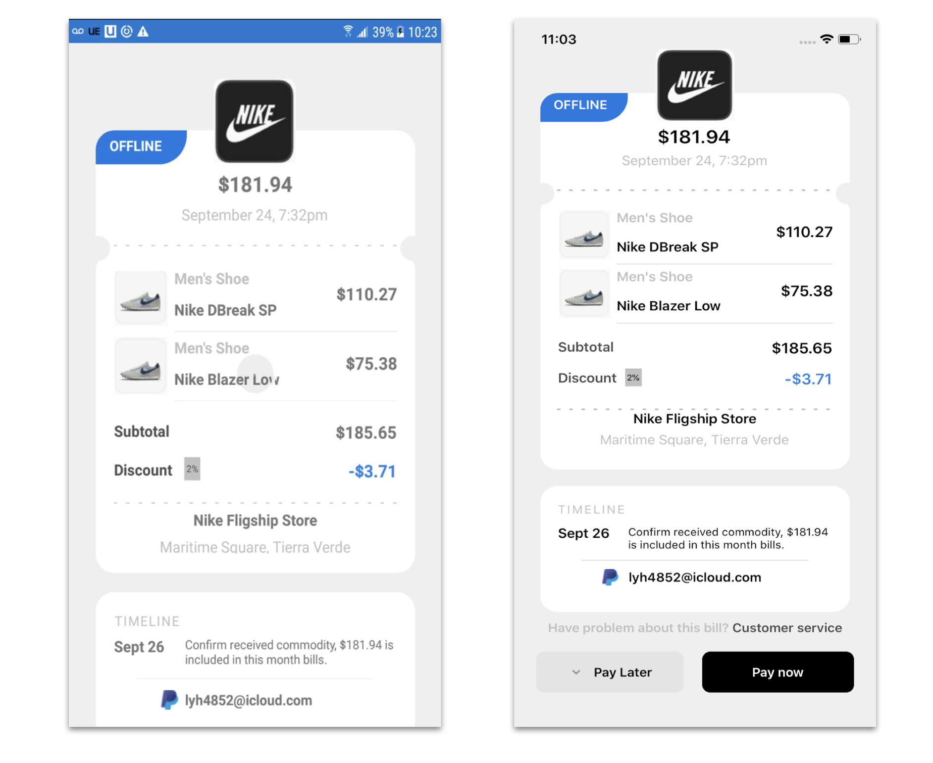
 In this case we are going to replicate a Bill Details UI Ap obtained from Dribble. You can check the design here!
 At the beginning, you will see an image with the original UI where you will see divided into blocks as we’ll be working on each part of the design.
 Each block presents the image with the design explicitly that we’ll be working on that block, they are highlighted in a box.
 In each of the code blocks, you can see a comment that says: “Here add the code that is being explained in the next block“. To keep you as focused as possible, this part indicates to you that the next block code explanation goes right where the comment line is added.
Let’s start!
Let’s divide the original design into blocks
To better understand, I have divided the original design into blocks, which are listed in the order in which we will be reproducing each one, these are:


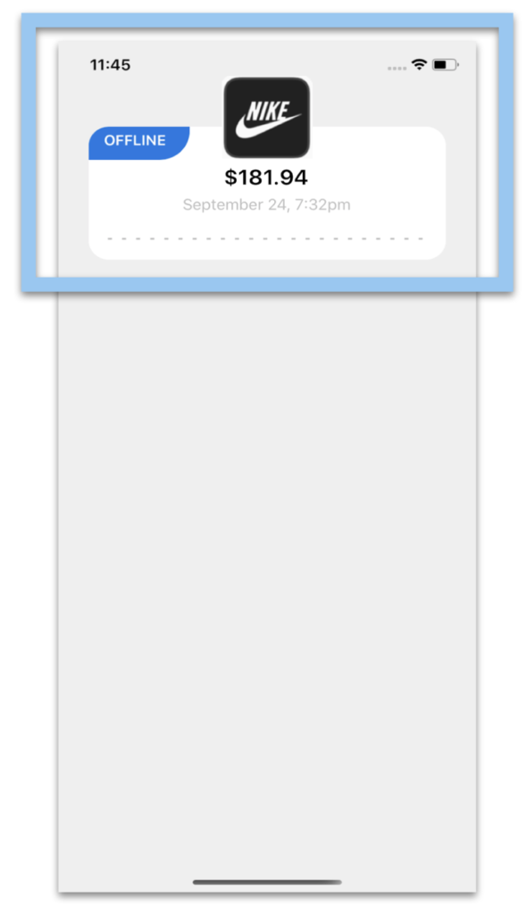
Defining the main structure: To start developing the complete design structure that will contain our first screen I will use a Grid. It’s important to note that we are using a ScrollView to prevent complications when viewing on small screens.
Once the main structure is defined, let’s start!
To replicate the first block we’ll be dividing into three parts:
1⃣ Frame with price information
2⃣ Main image
3⃣ Indicator Bar
1⃣ Starting with the Frame with price information, we will be exploring the Shape and the Styles! Let’s start with the .xaml implementation:
And then, as we see below, let’s create the three styles that will be applying to our controls: MainAmount, SecundaryText, and DivisionLine.
2⃣ Now, let’s continue with the Main image
3⃣ And finally, let’s add the indicator Bar. To do it, I used a PancakeVew! 💕

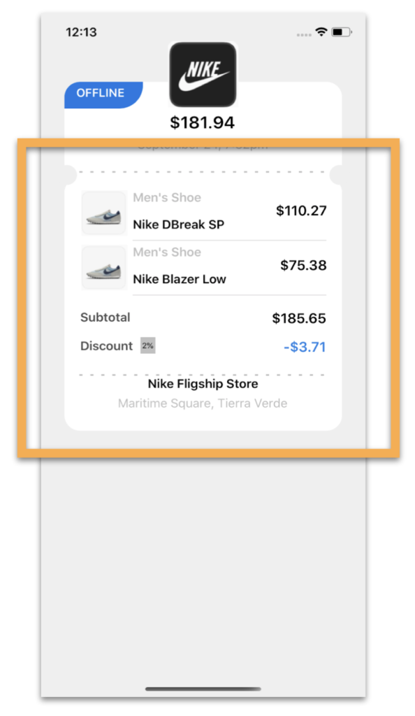
I love the part that comes now !! 😍 Because Shapes help us give the “Invoice” look we need! To get the shape of the rounded edges where the Frames meet, I created two circles and played with the Translation properties. Let’s see! 👀
To replicate, let’s divide into parts: Product List, Amount of products and the Rounded Border (With Shapes 💕). The first one is the Product list implementation:
The second one is the Amount of products part. Keep in mind that this part must the added in the block code previously added, exactly where says: “<!– Here add the code that is being explained in the next step–>”
And finally, the Rounded Corners with Shapes 😍!

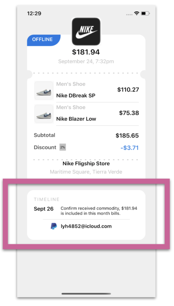
In the third block, we will develop the timeline of our App! 😎.

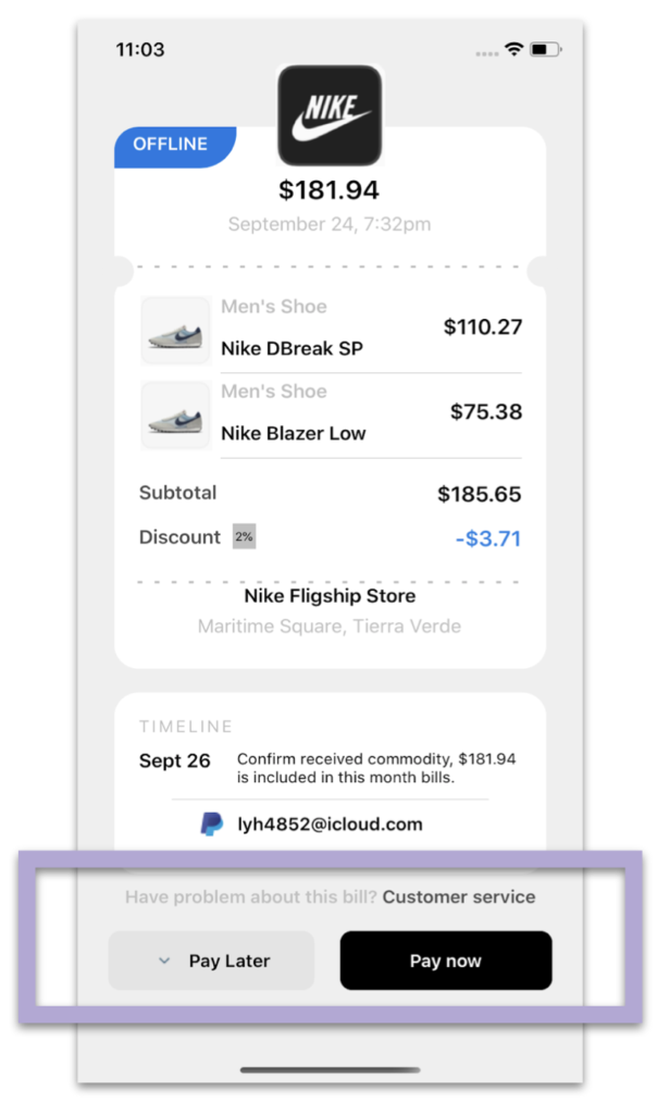
.
Finally, let’s add the Payment buttons block. It’s important to see FormattedText, it helps us to create a single label with different characteristics. 😎. 😎.
.
.
 .
.



Hey i want to expand the box in number two to display more item instead of scrolling through the collection view. could you assist me with this please. love your work
Hello! You can play with the HeigthRequest property and the VerticalOption property with an expandable value!