Howdy!!! ?♀ I’m continue doing what I love ?In this case we are going to replicate an Exotic Fruits UI obtained from Dribble. You can check it here!
⚠ Before starting, to get the best out of the post, I’ll leave you some instructional notes so that you have a better experience reproducing the UI:
➖ At the beginning, you will see an image with the original UI where you will see divided into blocks as we’ll be working each part of the design.
.
➖ Each block presents the image with the design explicitly that we’ll be working on that block, they are highlighted in a box.
.
➖ In each of the code blocks you can see a comment that says: “Here add the code that is being explained in the next block“. To keep you as focused as possible, this part indicates you that the next block code explanation goes right where the comment line is added.
.
➖ I will not be using styles so that the properties added to the various components can be seen and understood faster in the explanation process.
.
Let’s start!
Let’s divide the original design into blocks
To better understand, I have divided the original design into blocks, which are listed in the order in which we will be reproducing each one, these are:


.
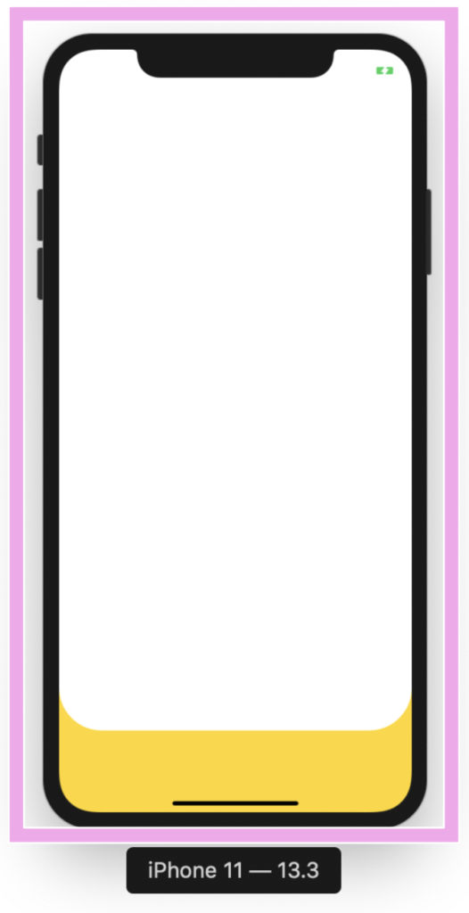
Let’s start! In this section we will be working with the “Market body” block. As we can see at the bottom we have a yellow division with rounded edges and the remaining part is in white. To achieve rounded edges I used PanCakeView NuGet package.
.
In the white part is where we will create the following blocks: Header, Fruit list and Market list, it’s for this reason that I created the complete main structure where we will be adding the other blocks of our design, in this case I used a Grid inside an ScrollView.
.

.
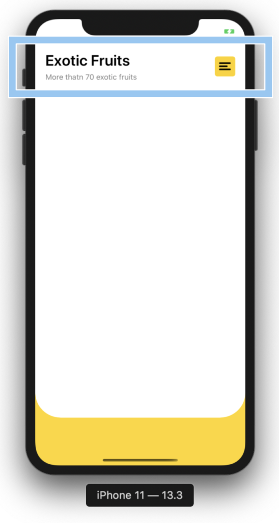
In this section we will be working with the “Header” block and to replicate it we just need to add the following parts:
.

.
➖ Title
.
➖ Description
.
➖ Hamburger Button
.
.
.
.cv.vvvvvvvvvvvvvvvvvv..

.

.
.
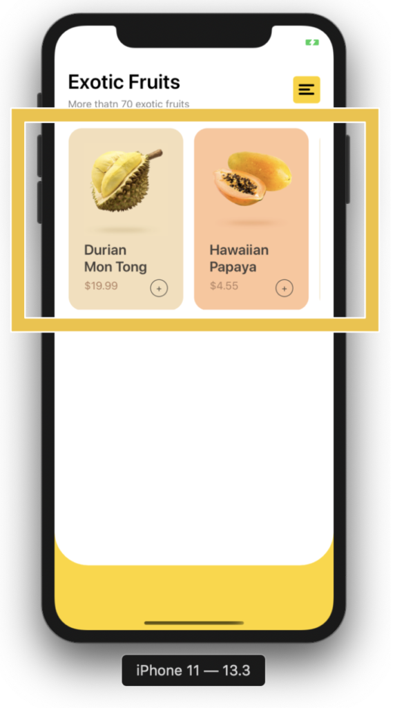
Let’s continue with our next block named Fruit List. Here we will be using a CollectionView. It’s important that the project adheres to the MVVM Design pattern. That’s why I used text properties Binded.
.
To replicate this block we just need to add the following parts:
.
➖ Fruit picture
.
➖ Name
.➖ Price
.
➖ A Button to add (+)
.

.T
In this block I used a CollectionView and PancakeView too.


.
.
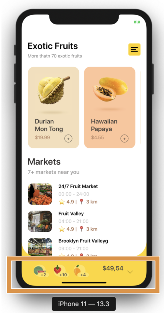
 For this last block I used BindableLayout. If you don’t know about this great Layout you can read it here.
.
Do you remember the Market body block explanation? Yes! ? Okey.. In this block code I defined the full layout structure in which will be contained the design, please locate the comment that say: ” Here add the code that is being explained in the “Market bar” block” and add the following code:
.


Thank you so much for this series on Xamarin UI, you have helped me improve my xamarin skills so March and I just started this year 🙂
Thank you dear!! I’m feel very happy to know it!! ?
Very good , looks nice
Thanks ☺️!
nice implementation, gave me a great idea, thanks
Very good nice to know!
I loved your blog and the didactic way you write. This example of you has clean, easy-to-understand code. I would ask if you can show the parallax effect in the fruit section Fruit List.
Hi Jose! Thank you very much!?? it’s a pleasure for me!? and I’ll add on my writing list the Parallax effect explanation!
Hi,
Your blog showed me great ideas on how to treat the Layout in Xamarin Forms.
jcm
??? Great to know! it’s a pleasure for me! ??