When designing user interfaces, there are may ways to handle / create elements into it. We know that the way we do it can either save us many lines of code or not, and also can have an impact in the performance of our application.
At the Microsoft 365 LIVE event I talked about this topic and now I wanted to write it into an article! In general we will be seeing some tips for more effective handling of our XAML code!
Let’s start!
1. Use the fewest layouts possible ?
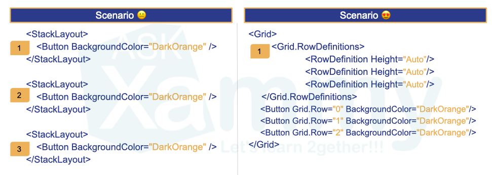
It is important to know how each of the layouts work, a simple layout change can make our code cleaner and a lot more understandable.
.. Let’s see the first tip as follows … If you have to go to the supermarket and you live on a third floor and you don’t have an elevator, how would you prefer to get your groceries into your apartment?
?♀ Climb the stairs with a bag of food, and then have to go back to find the second bag and repeat the process until you finish …?
?♀ Or do you prefer to have the option to upload the entire purchase in a single bag and that its weight is lighter?
Obviously the answer is the second one!! In the image we see two different scenarios which both produce the same visual result with the difference that for the first scenario we made it with three layouts and in the second we made it with only one! Why not use one!? … Think of the groceries example and you won’t forget it! ?
2. Create your color palette in the Application.Resource
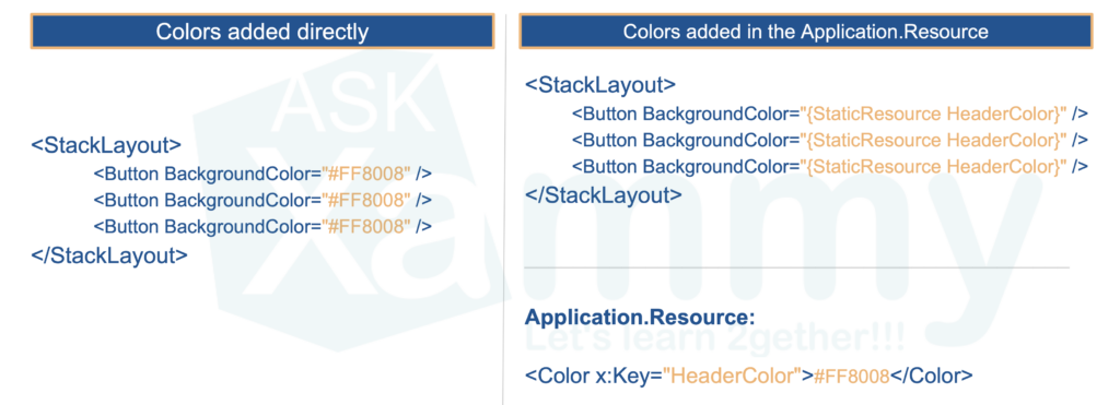
Have you ever had to change the full branding of an app after it was developed and you had to go property by property within each XAML file to assign the new colors? … ?
What if you had had the colors in the Application.Resource instead? This way we only have to add the color once in our code, and add it to all the controls that we need through the key that we have assigned to each resource. So all the colors of your App will be centralized and if you have to change them at any given time you will only have to do it in one place!
3. Do you have a repetitive layout design? Use BindableLayout!
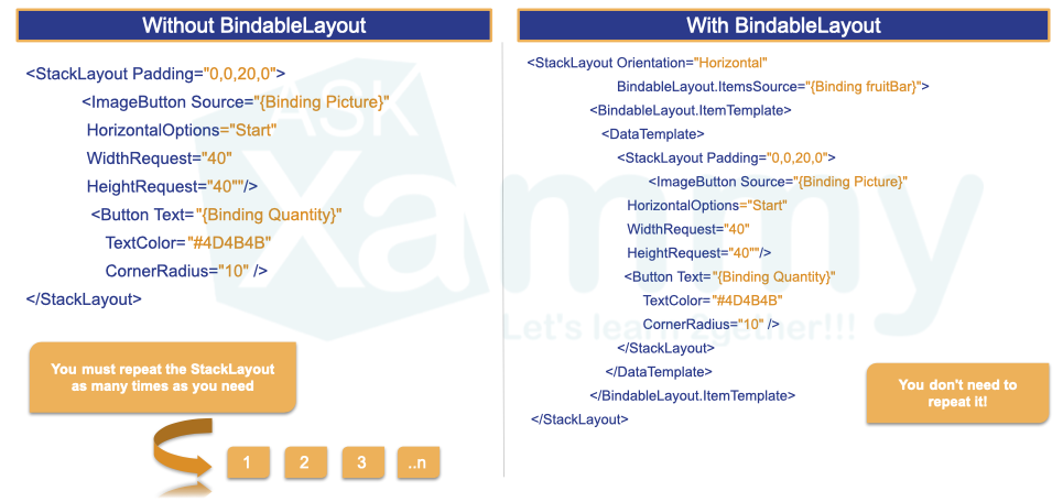
If you have a design in which you need to repeat layouts, with the BindableLayout you can save the repeated code! You just have to design a unique layout! And the BindableLayout will take care of the rest!
4. Life is better using styles ?

Without the use of styles we would have to repeat the same properties for each element as many times we declare it. ?♀ By implementing styles we only have to add the properties once and this style can be called from the elements we need!
But there is something cooler! ?
If all your controls of the same type will have the same properties, you can use global (Implicit) styles! And guess what?? Without having to assign it to each graphic control, all controls will take them!
If you don’t know about style you can read here.
Finally you also can inherit styles! You can read more information here.
5. Use FormattedText!
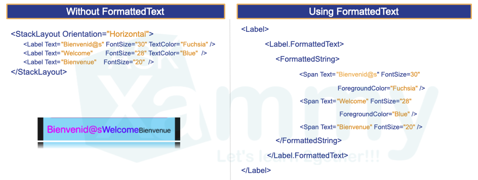
In this way we can create different styles in the same label, without having to repeat the label for each different style we have!
6. Don’t confuse Margin and Padding please ?

Unfortunately it is absolutely common to confuse these two properties, and refer to one instead of the other like “Add Margin or Padding or the first one that appears”. ? They do not do the same, with this image you can understand a little the difference between both!
And always remember that:
? Margin property represents the distance between an element and its adjacent elements, is used to control the elements rendering position and the rendering position of its neighbors.
? While Padding property represents the distance between an element and its child elements, and is used to separate the control from its own content.
7. Use the ScrollView!

Not all devices have the same dimensions, sometimes we are designing in a device that covers all the design we are creating, but what if I try it on a smaller device? The design will not be able to slide and therefore it will stay halfway! That’s what the ScrollView is for!
⚠ If you are interested in reproducing the previously shown UI you can enter here!
8. Test your interfaces on different devices, platforms and orientations.
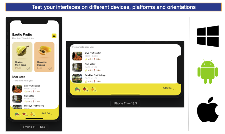
And last but not least, it is extremely important to perform our tests on different devices, platforms and orienta
⚠ If your design does not contemplate some type of orientation (For example horizontal), be sure to block the movement so that if the user horizontally places the device, the design remains in the desired orientation.
⚠ If you are interested in reproducing the previously shown UI you can enter here!
I hope this article has been helpful to you and that from now on you can apply this new knowledge! ?
Spanish post: https://medium.com/@reyes.leomaris/sometips-mejores-prácticas-para-el-manejo-de-ui-247c0e99cb47
Thanks for reading!!!


Hi I’m very new in Xamarin, I read your article it’s very nice and intersting, I want more tips about Xamarin pls keep in touch.
Thank you! Nice to know it!! ???
Hola estoy empezando con xamarin forms y acabo de leer tu artículo y esta muy bueno, se agradece
Hola Gilleroha! Super!! Keep going! Muchas gracias ?
Thank you 🙂
You’re welcome! ?
Very thoughful article. You covered the most important points in excellent way.
Thank you! ?
Thanks , very helpful again
Thanks!! ??
Great article to those who have just started working on Xamarin.
?? Thanks!
Great content (as always) even for experienced XAML (not only Xamarin) developers, simple and with good examples
?? Thank you!