
In collaboration with Luis Beltrán’s Advent Calendar 2022, today I’ll be teaching you step by step how to implement the TwoPaneView in .NET MAUI! Sometimes we have to adapt our design for foldable devices to give the best user experience, that’s why this is an important topic.
This article will have the following structure:
➖What is TwoPaneView?
➖Foldable device support
➖Inicial setup
➖ Adding a TwoPaneView
➖Limitations
Let’s start!
What is TwoPaneView?
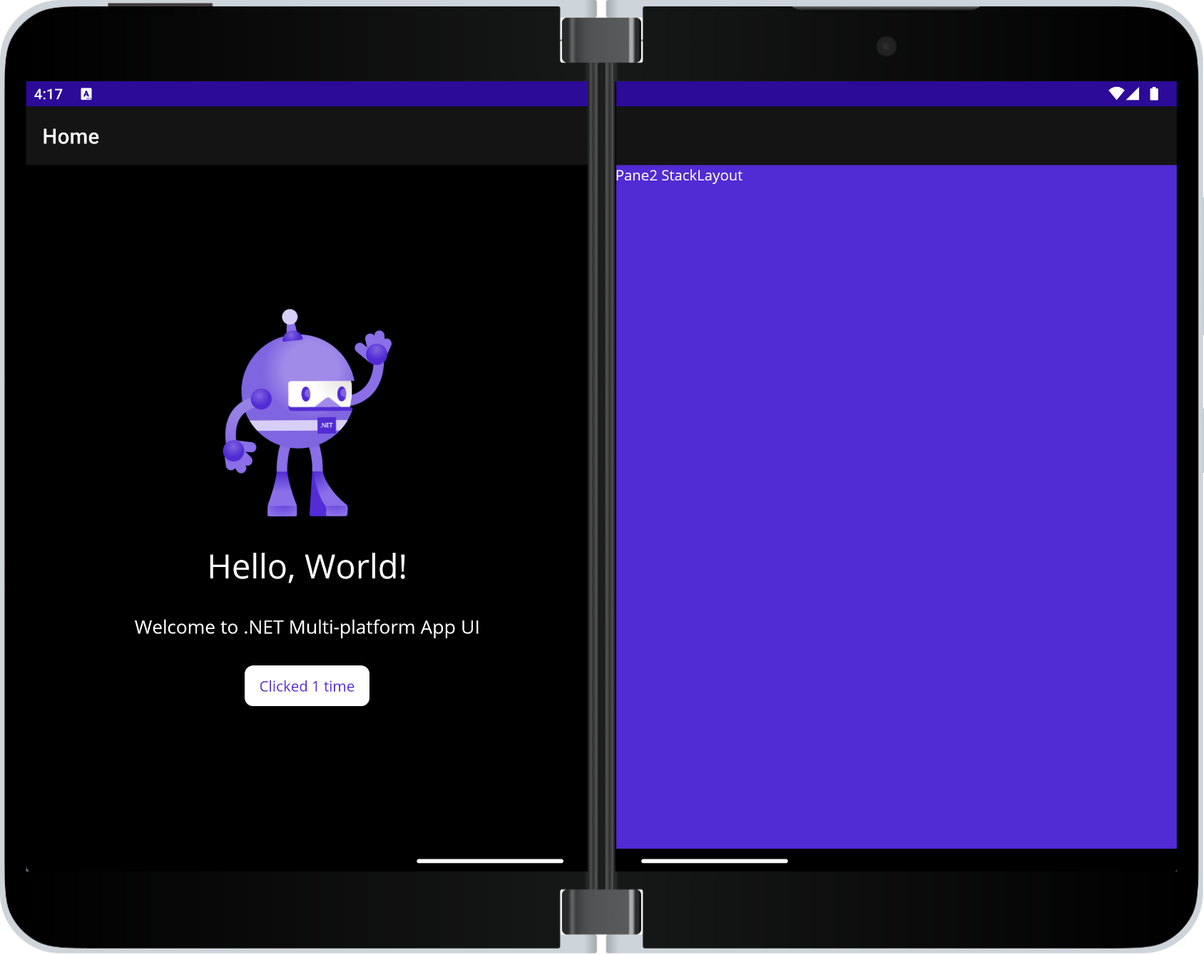
The TwoPaneView class represents a container with two views that can be next to or below each other, these views adjust to the size and position of the content in the available space on the device.
Foldable device support
Foldable devices include Microsoft Surface Duo and Android devices from other manufacturers. This makes it easier to adapt the design to different types of mobile or computer devices while adjusting screen size and orientations on the same device, including adapting to a hinge or crease on the screen.
🔧 Initial setup
To implement it in our App, you must apply some steps, which I explain below:
Add from NuGet Package the plugin: Microsoft.Maui.Controls.Foldable

Let’s add a TwoPaneView
Now that we have the above settings applied, let’s get started with the code implementation of the TwoPaneView! 😎
The first thing you need is to add the namespace in the XAML!
Understanding the Foldable structure tags

-
- <foldable:TwoPaneView>: It is responsible for initializing the TwoPaneView.
- <foldable:TwoPaneView.PaneX>: Indicates each of the panels, inside you must add all the visual elements you need. Where it says “PaneX” you can replace it with both Pane1 and Pane2.
- PaneX: Here you can add the Pane you are working on which can be “Pane1” or “Pane2”. It is necessary to repeat the same labels from the previous step for each Pane.
Code implementation
TwoPaneView modes
We have some properties that help us organize the positions of each panel on our screen, let’s see each one of them:
➖Wide: By means of the WideModeConfiguration property the panels are placed horizontally on the screen.
Supported values allow to organice your panels are the follows:
- LeftRight: Organize the panels from Left to Right.
- RightLeft: Organize the panels from Right to Left.
- SinglePane: Only one panel to be seen.
➖ Tall: By means of the TallModeConfiguration property the panels are placed vertically on the screen.
Supported values allow to organice your panels are the follows:
- BottomTop: Organize the panels from Bottom to Top.
- TopBottom: Organize the panels from Top to Bottom.
- SinglePane: Only one panel to be seen..
📋 Please note that only one of these modes can be active.
Control TwoPaneView when it’s only on one screen
- MinTallModeHeight is responsible to establish the minimum height the control must be to enter Tall mode.
- MinWideModeWidth is responsible to establish the minimum width the control must be to enter Wide mode.
- Pane1Length / Pane2Length sets the width of Pane1 and Pane 2 respectively to Wide mode. The height of both Panes in Tall mode and have no effect in SinglePane mode.
Properties that apply when on one screen or two
- TallModeConfiguration Sets two options, the first is when the Top/Bottom layout is in High mode, the second if you only want a single pane to be visible as defined by TwoPaneViewPriority.
- WideModeConfiguration Sets two options, the first is when in Wide mode, the Left/Right arrangement, the second if you only want a single pane to be visible as defined by TwoPaneViewPriority.
- PanePriority determines the Pane to display (Pane1 or Pane2) when in SinglePane mode.
🚫 Limitations
➖ If the TwoPaneView is spanned across a hinge or fold the properties when it’s only on one screen have no effect.
➖ Only fits Android foldable devices that introduced the Jetpack Window Manager API provided by Google (such as Microsoft Surface Duo).
➖ On all other platforms and devices, it acts as a responsive and configurable split view that can dynamically display one or two panes, proportionally sized on the screen.
Thanks for reading! 👋
See you next time! 💚💕
Spanish article: https://es.askxammy.com/twopaneview-layout-en-net-maui/

3 thoughts on “Getting started with TwoPaneView layout in .NET MAUI”