

 In this case we are going to replicate a Bill Details UI Ap obtained from Dribble. You can check the design here!
 Before starting, to get the best out of the post, I’ll leave you some instructional notes so that you have a better experience reproducing the UI:
 At the beginning, you will see an image with the original UI where you will see divided into blocks as we’ll be working on each part of the design. Each block presents the image with the design explicitly that we’ll be working on that block, they are highlighted in a box. In each of the code blocks, you can see a comment that says: “Here add the code that is being explained in the next block“. To keep you as focused as possible, this part indicates to you that the next block code explanation goes right where the comment line is added. I will not be using styles so that the properties added to the various components can be seen and understood faster in the explanation process.
Let’s start!
Let’s divide the original design into blocks
To better understand, I have divided the original design into blocks, which are listed in the order in which we will be reproducing each one, these are:


Before we begin, let’s consider some important points to add to our first screen:
- Hide the status bar:
In your Info.plist add the following lines:

In your MainActivity.cs inside OnCreate method, add the following lines:

2. We will assign a BackgroundColor to the ContentPage
 So, now let’s start! The first step is to create the main structure which will be containing the design.
For the rounded borders, we’ll use PancakeView! Inside it, add the following code:

 For the second block, we’ll include the details of the product. In this case, we need to make the rounded appearance of the previous block a continuation of it. Let’s see how to do it.🤓
We will divide it into two parts:
1. First block of code with the first edge of the right rounded
2. In this second part we will add a Pancake to give continuity to the completion of the block with the rounded bottom edges


Finally, let’s add the “Add to Cart” button! With this step, we have completed the design of the first screen.
Here we are going to add simple navigation to be able to present the other screen from this button, for this reason in the previous code block you can see the Clicked = “Btn_Clicked” event. And then we proceed to create the event:

 Now let’s start with the second screen! The first block is called “Header”. We’ll continue to maintain the same effect of the continuous edges, for this screen we will have the following components:
- Title
- Quantity of items
- The button of accumulated items
⚠ On this screen, you must also set the BackgroundColor property in the ContentPage as in the previous one.

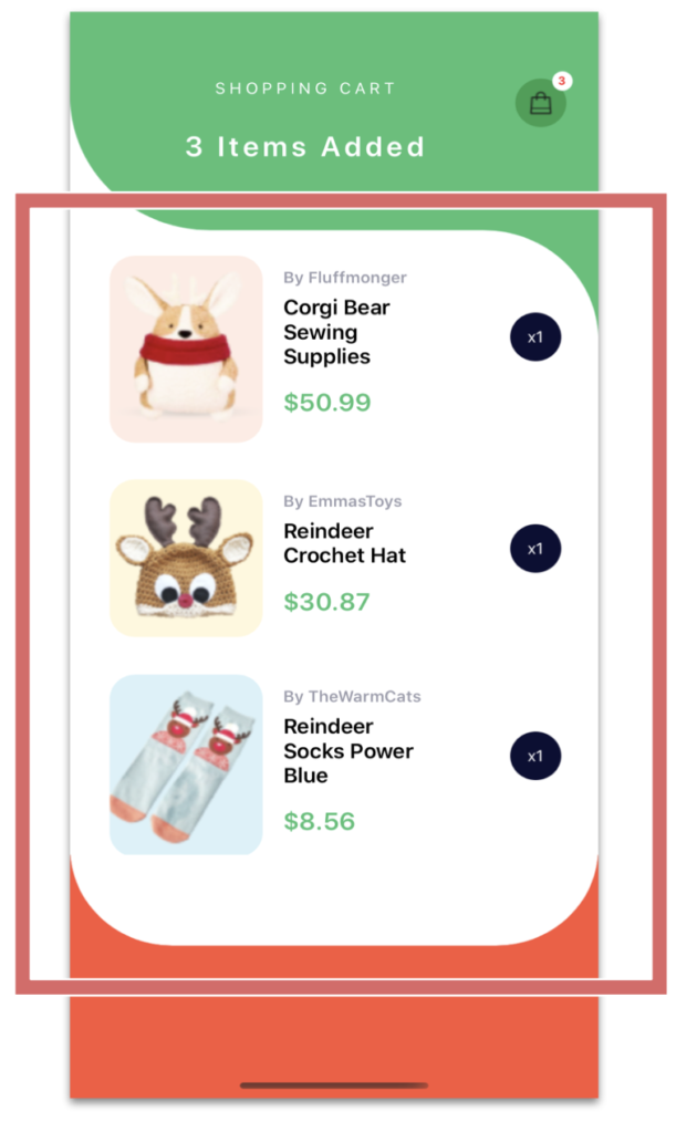 Let’s continue with the list of Items added. To do it we will use a CollectionView!

 .
.
And finally, the payment block which contains the total amount from items added to our list!
.
.
..
.
.
.

 .
.


Superb work! You’re a pro
Thank you 😍!!
Awesome… You make UI design in Xamarin Forms sooo easy …. 2 Thumbs Up !
Thank you 🙈💚