
An Avatar is a graphical representation that is associated with a specific user for identification purposes. This is widely used in our everyday applications, and that is why it’s important that you have the tools at hand that will help you achieve it.. In this article we will learn how to implement the .NET Maui Community Toolkit AvatarView in very simple and quick steps!
We will learn to integrate it in a simple way! 💕 The explanation will be divided into the following points:
🔹 .NET MAUI Community Toolkit: Implementation
🔹 Preparing your XAML to add the AvatarView
➖ Knowing the AvatarView’s properties
Let’s start!
.NET MAUI Community Toolkit: Implementation
The key to achieve drawing in our App is to use Community.ToolKit.Maui NuGet package, let’s see its definition and how to implement it.
What is .NET MAUI Community Toolkit??
It’s a collection of reusable elements such as animations, behaviors converters, among others, for developing applications for iOS, Android, macOS and WinUI using MAUI.
Let’s implement it:
-
- Add from NuGet Package: Community.Toolkit.Maui

-
- Now let’s initialize: Go to your MauiProgram.cs file
In the CreateMauiApp method, place in the .UseMauiApp<App>() line and just below it add the following line of code:
⚠ Don’t forget to add the using CommunityToolkit.Maui;at the top of the class.
Preparing your XAML to add the AvatarView
What is AvatarView?
AvatarView is a control provided by Community.Toolkit.Maui which is responsible for providing a user’s avatar image or their initials. This one can be text, colores or shaped. And all with support for shadows and gestures.
To continue, add the following namespace on your XAML:
Then, you have to add the DrawingView tag with the properties that you need:
Knowing the DrawingView’s properties
It has different useful properties, let’s know some of them:

➖ BackgroundColor: Sets the background color that the AvatarView will have.
➖ BorderColor and BorderWidth: Are responsible of establishing the color and width of the border respectively, which the AvatarView will have.
➖ Text and TextColor: Allow us to establish text and color of the letters respectively.
➖ CornerRadius: Determines the shape of the control.
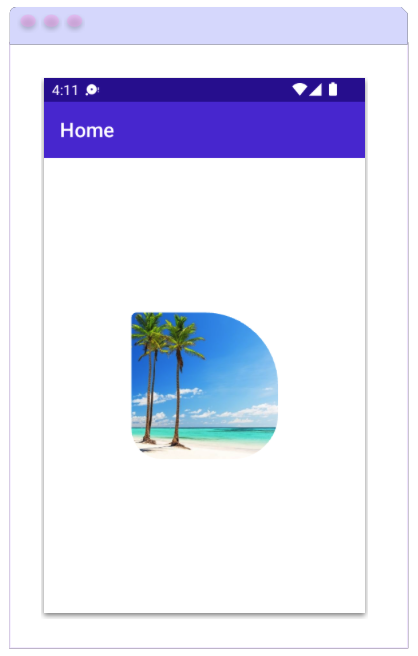 You can also add an image using the ImageSource property.
The CornerRadius Property, beside allowing us to set a single value to round all smooth edges, also allows us to add separate values for the top left, top right, bottom left, and bottom right of the control.
⚠ Keep in mind that if you add an image, you won’t be able to display the text.
✍️ Additional information
The default value for the AvatarView’s WidthRequest and HeightRequest properties is 48. Unless the AvatarView is constrained by its design or the value of these properties is specified.
Spanish article: https://es.askxammy.com/agregando-un-avatar-con-net-maui-community-toolkit/

I’m loving the AvatarView in .NET MAUI Community Toolkit! It’s so helpful to be able to see all my avatars at once!
💚