

Merry Christmas! 🎄 I hope you are very well on these dates and you are happy with yours! 💓 It’s a time where we usually set goals for the next year with the aim of continuing to grow every day! And to contribute to your goals of practicing XAML, I have brought you this article as my last gift of the year, we will be exploring a Christmas UI by Anton Mishin obtained from Dribbble.
In addition to using XAML, in this article we will learn about the following topics:
➖ XAML Styles
➖ Adding external Fonts
➖ Adaptation to light and dark mode
➖ Shadows
Let’s start!
Let’s divide the original design into blocks
For a better understanding, I divided the original design into blocks, which are listed in the order in which we will be reproducing each one:
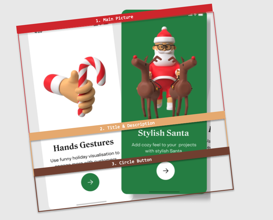

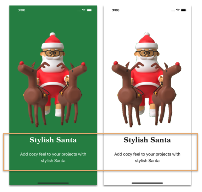
Both screens have the same visual elements, so I’ll explain them simultaneously in each block. We’ll start by creating the WalkingStickPage.xaml page which is composed by the following elements:
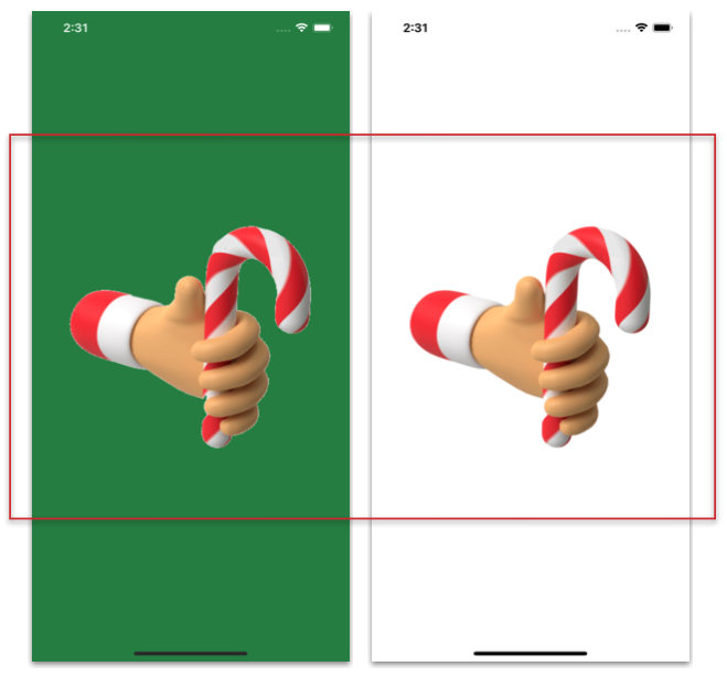
 BackgroundColor: It will have a background color that accommodates light and dark modes (this’s why you’ll see the AppThemeBinding markup extension). This time the light mode will have a white background color while the dark mode will have a dark green one. Add it to your Contentpage as follows:
📋 If you want to know more information about handling light and dark modes in your apps, I recommend the article “Handling Light and Dark Mode With .NET MAUI”.
-
- Did you notice that the dark green color is added as a StaticResource? This helps us to have the color in a single source, so maintenance will be easier because we only have to change it once. Go to Resources ➡ Styles ➡ Colors.xaml and add the following:
Main layout: We’ll use the VerticalStackLayout as the main layout and add its properties in a style. Let’s start by creating the style:
📋 If you want to know more information about VerticalStackLayout, I recommend the article “Horizontal & VerticalStackLayout in .NET MAUI”.
Now, let’s add the layout and the main image to our .xaml:
Let’s see the results for both light and dark mode!
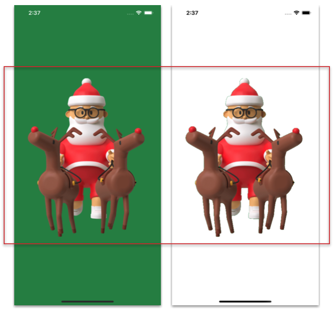
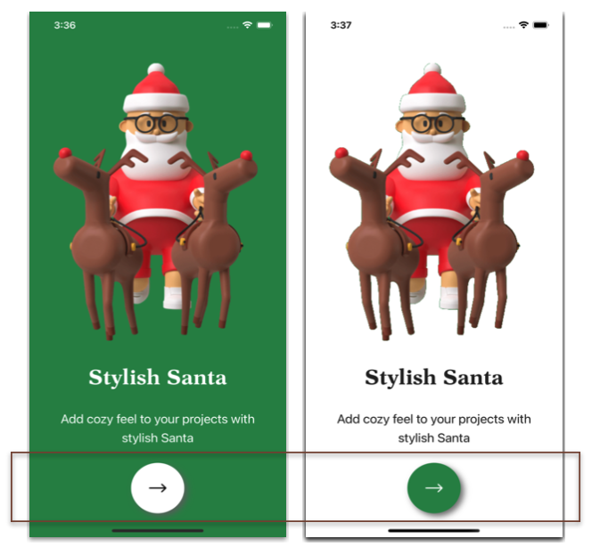
Also, let’s take the opportunity to create the other page (SantaClaus.xaml), this will benefit from the styles and resources created above (don’t forget to add the BackgroundColor to your Contentpage). We just have to add the following code:

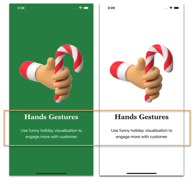
This block contains a Title and a Description. At this point we’ll be focusing on implementing styles and we’ll be also adding external Fonts, as you can see below:
- Styles for Title and Description
- Adding external Fonts
We’ll add the fonts: Dutch-Bold for the Title and Antebas for the Description.
💡 Tip: If you don’t know the name of the font that your UI has, I recommend WhatTheFont, uploading a screenshot of your UI, this site will indicate the name of the font and other similar ones.
📋 For more information on how to add external fonts I recommend the article “Adding Fonts in .NET MAUI”.
Let’s add them to the WalkingStickPage.xaml page: Add your labels with the new fonts and styles!
Let’s continue with the SantaClausPage.xaml page

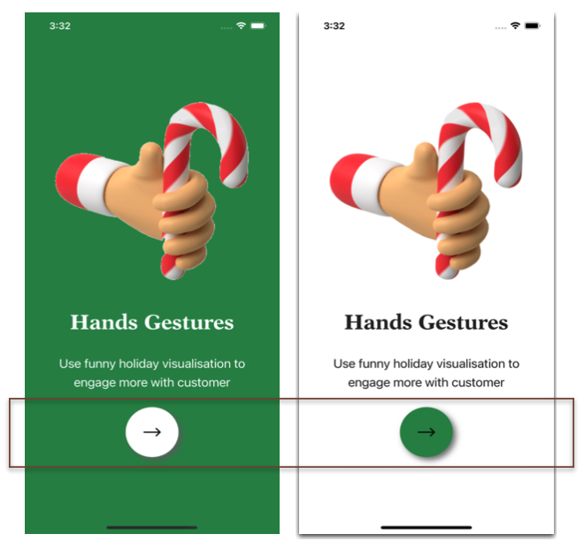
Finally, we have a circular button with a shadow behind it!
Let’s start creating the Button style
Add the Button with Shadow
📋 If you want to know more information about Shadows, I recommend the article “Adding Shadows with .NET MAUI”
This code is exactly the same for both WalkingStickPage.xaml and SantaClausPage.xaml, so I won’t add another block of code. Let’s see the results of both:
- WalkingStickPage.xaml
- SantaClausPage.xaml
And done!!  In a few minutes we have practiced different interesting topics by replicating this Christmas UI! I hope you liked it! 💚💕


Hi,
I am looking for more articles like this.
Thank you
💚