Before starting, to get the best out of the post, I’ll leave you some instructional notes so that you have a better experience reproducing the UI:
Let’s start!
Let’s divide the original design into blocks
To better understand, I have divided the original design into blocks, which are listed in the order in which we will be reproducing each one, these are:
<!-- Main structure--> | |
<Grid Margin="20,40,0,0"> | |
<Grid.RowDefinitions> | |
<RowDefinition Height="Auto"/> | |
<RowDefinition Height="*"/> | |
</Grid.RowDefinitions> | |
<Grid.ColumnDefinitions> | |
<ColumnDefinition Width="*"/> | |
<ColumnDefinition Width="Auto"/> | |
</Grid.ColumnDefinitions> | |
<!-- Here add the code that is being explained in the next block--> | |
</Grid> |

<!-- 1.1 Main Wall--> | |
<Image Grid.Column="0" Grid.Row="0" Source="HamburgerMenu" HorizontalOptions="Start"/> | |
<Image Grid.Column="2" Grid.Row="0" Source="Add" HorizontalOptions="End" Margin="0,0,10,0"/> | |
<Label Grid.Column="0" Grid.Row="1" Text="Delivering to" TextColor="Silver" Margin="{OnPlatform Android='0,20,0,0', iOS='0,40,0,0'}"/> | |
<Label Grid.Column="0" Grid.Row="2" Grid.ColumnSpan="2" Text="Current location" FontSize="20" FontAttributes="Bold"/> | |
<Image Grid.Column="1" Grid.Row="2" HeightRequest="20" Source="Arrow" HorizontalOptions="Start"/> | |
<SearchBar Grid.Column="0" Grid.Row="3" Grid.ColumnSpan="2" Placeholder="Search food" BackgroundColor="Transparent" HorizontalOptions="Fill"/> | |
<Image Grid.Column="2" Grid.Row="3" Source="Order" Margin="0,0,10,0" HorizontalOptions="End" /> | |
<!-- Here add the code that is being explained in the next block--> |

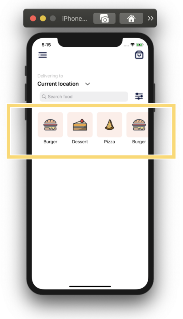
Let’s continue with our next block named 1.2 Menu. Here we will be using a horizontal CollectionView. It’s important that the project adheres to the MVVM Design pattern. That’s why I used text properties Binded.
<!--1.2 Menu --> | |
<CollectionView ItemsSource="{Binding menu}" | |
Margin="0,20" | |
HeightRequest="125" | |
VerticalOptions="FillAndExpand" | |
HorizontalScrollBarVisibility="Never" | |
ItemsLayout="HorizontalList" | |
Grid.Row="4" Grid.Column="0" Grid.ColumnSpan="3"> | |
<CollectionView.ItemTemplate> | |
<DataTemplate> | |
<StackLayout Padding="0,0,15,0"> | |
<Frame HeightRequest="50" HasShadow="False" BackgroundColor="#feeee8" CornerRadius="10"> | |
<Image Source="{Binding Picture}"/> | |
</Frame> | |
<Label Text="{Binding Name}" HorizontalTextAlignment="Center"/> | |
</StackLayout> | |
</DataTemplate> | |
</CollectionView.ItemTemplate> | |
</CollectionView> |

<!--1.3 Popular menu--> | |
<Label Grid.Row="5" Grid.Column="0" Text="Popular" FontSize="25" FontAttributes="Bold"/> | |
<CollectionView ItemsSource="{Binding popularFood}" | |
Margin="0,20,10,0" | |
VerticalOptions="Start" | |
VerticalScrollBarVisibility="Never" | |
Grid.Row="6" Grid.Column="0" Grid.ColumnSpan="3"> | |
<CollectionView.ItemTemplate> | |
<DataTemplate> | |
<StackLayout Margin="0,15"> | |
<Grid> | |
<Grid.RowDefinitions> | |
<RowDefinition Height="Auto"/> | |
</Grid.RowDefinitions> | |
<PanCake:PancakeView Grid.Row="0" CornerRadius="20" Margin="0,0,10,0"> | |
<Image Source="{Binding Picture}" HeightRequest="220" Aspect="Fill"/> | |
</PanCake:PancakeView> | |
<Frame Grid.Row="1" Margin="20,-80,20,70" BackgroundColor="White" CornerRadius="15" HorizontalOptions="End" > | |
<Label Text="{Binding IntervalTime}" FontSize="10" FontAttributes="Bold" TextColor="Black" HeightRequest="10" /> | |
</Frame> | |
<Label Grid.Row="1" Text="{Binding Name}" FontSize="22" FontAttributes="Bold" VerticalTextAlignment="Center"/> | |
<Image Grid.Row="2" Source="Star" HorizontalOptions="Start" WidthRequest="20"/> | |
<Label Grid.Row="2" Margin="30,0,0,0" FontSize="15" VerticalOptions="Center"> | |
<Label.FormattedText> | |
<FormattedString> | |
<Span Text="{Binding Rating}" FontAttributes="Bold" /> | |
<Span Text="{Binding Description}" TextColor="#a4a7b6" /> | |
</FormattedString> | |
</Label.FormattedText> | |
</Label> | |
</Grid> | |
</StackLayout> | |
</DataTemplate> | |
</CollectionView.ItemTemplate> | |
</CollectionView> |
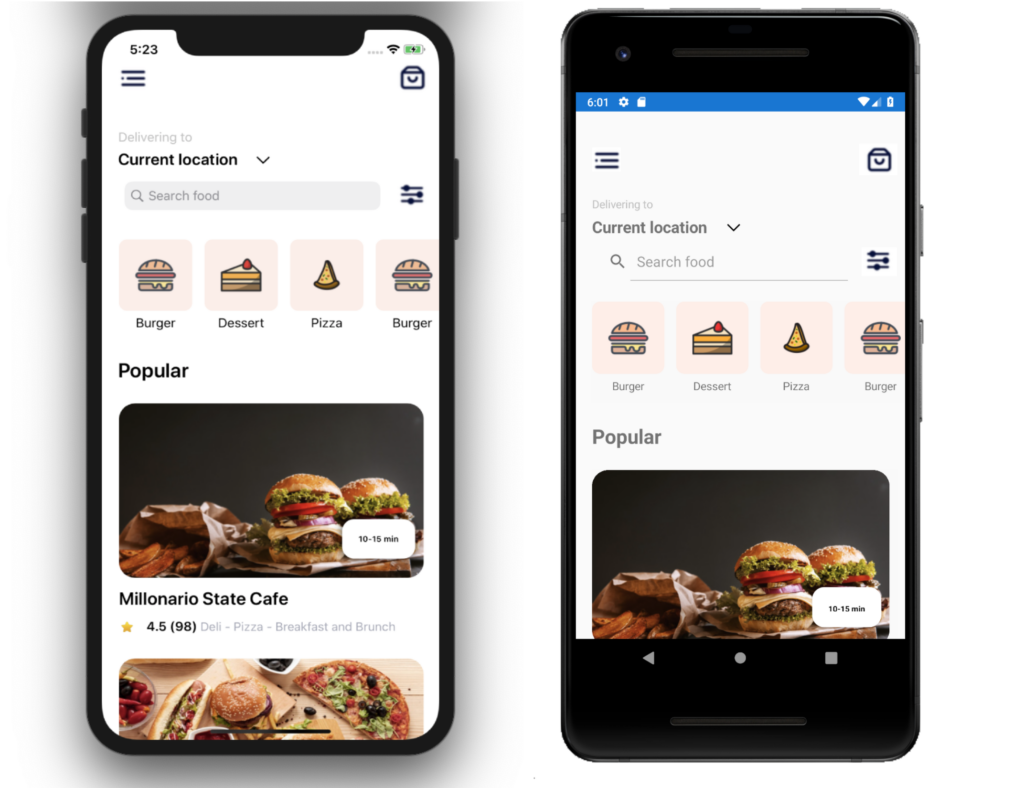
Finally, the result of the first screen! ??
Let’s continue with the second page!
Defining the main structure: To start developing the complete design structure that will contain our second screen I will use a Grid.
<Grid> | |
<!-- 2.0 Main structure--> | |
<Grid.RowDefinitions> | |
<RowDefinition Height="Auto"/> | |
<RowDefinition Height="*"/> | |
</Grid.RowDefinitions> | |
<!-- Here add the code that is being explained in the next block--> | |
</Grid> |
.
Once created the main structure of our second screen, let’s start with the first block! In this part we will be working with the Main picture block and to replicate it we just need to add the following parts:
<!-- 2.1 Main body--> | |
<Image Grid.Row="0" Source="MainBurger" Aspect="AspectFit" VerticalOptions="Start"/> | |
<Label Grid.Row="1" Text="Burgers" TextColor="White" FontAttributes="Bold" FontSize="35" Margin="25,-85,0,0"/> |
.
To replicate the “Rounded board” block, we just need to work with PancakeView to achieve the oval shapes above.
.
<!-- 2.2 Rounded board--> | |
<PanCake:PancakeView Grid.Row="2" CornerRadius="30" BackgroundColor="White" Margin="0,-40"> | |
<!-- Struture for the next block--> | |
<Grid Padding="25,30"> | |
<Grid.ColumnDefinitions> | |
<ColumnDefinition Width="*"/> | |
<ColumnDefinition Width="Auto"/> | |
</Grid.ColumnDefinitions> | |
<Grid.RowDefinitions> | |
<RowDefinition Height="Auto"/> | |
<RowDefinition Height="*"/> | |
</Grid.RowDefinitions> | |
<!-- Here add the code that is being explained in the next block--> | |
</Grid> | |
</PanCake:PancakeView> |
.
To replicate the “Legend” block we just need to add the following parts:
.
<!-- 2.3 Legend--> | |
<Label Grid.Row="0" Grid.Column="0" Text="56 Restaurants" FontAttributes="Bold" FontSize="18"/> | |
<Image Grid.Row="0" Grid.Column="1" Source="More"/> | |
<!-- Here add the code that is being explained in the next block--> |
.
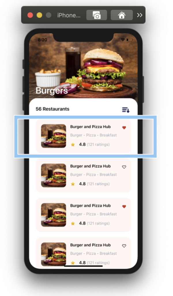
Finally, the last block named Menu options! I also used a CollectionView to replicate it!
<!-- 2.4 Menu options--> | |
<CollectionView ItemsSource="{Binding burgers}" | |
VerticalOptions="Start" | |
VerticalScrollBarVisibility="Never" | |
Grid.Row="1" Grid.Column="0" Grid.ColumnSpan="2"> | |
<CollectionView.ItemTemplate> | |
<DataTemplate> | |
<StackLayout> | |
<Frame HasShadow="False" BackgroundColor="#fef6f2" HeightRequest="90" CornerRadius="20" Margin="0,10"> | |
<Grid> | |
<Grid.ColumnDefinitions> | |
<ColumnDefinition Width="Auto"/> | |
<ColumnDefinition Width="*"/> | |
<ColumnDefinition Width="Auto"/> | |
</Grid.ColumnDefinitions> | |
<Grid.RowDefinitions> | |
<RowDefinition Height="*"/> | |
</Grid.RowDefinitions> | |
<PanCake:PancakeView Grid.Column="0" Grid.Row="0" Grid.RowSpan="3" CornerRadius="12" Margin="0,0,10,0"> | |
<Image Source="MainBurger" HeightRequest="100" WidthRequest="95" Aspect="AspectFill"/> | |
</PanCake:PancakeView> | |
<Label Grid.Row="0" Grid.Column="1" Grid.ColumnSpan="2" Text="{Binding Name}" FontSize="15" FontAttributes="Bold"/> | |
<Label Grid.Row="1" Grid.Column="1" Grid.ColumnSpan="2" Text="{Binding Description}" FontSize="15" TextColor="#a4a7b6"/> | |
<Image Grid.Row="2" Grid.Column="1" Source="Star" HorizontalOptions="Start" WidthRequest="20"/> | |
<Label Grid.Row="2" Grid.Column="1" Margin="30,0,0,0" FontSize="15" VerticalOptions="Center"> | |
<Label.FormattedText> | |
<FormattedString> | |
<Span Text="{Binding Rating}" FontAttributes="Bold" /> | |
<Span Text="{Binding RatingDetail}" TextColor="#a4a7b6" /> | |
</FormattedString> | |
</Label.FormattedText> | |
</Label> | |
<Image Grid.Row="0" Grid.Column="2" Source="{Binding HomeSelected}" HeightRequest="15" /> </Grid> | |
</Frame> | |
</StackLayout> | |
</DataTemplate> | |
</CollectionView.ItemTemplate> | |
</CollectionView> |
And the result of the second screen it’s done! ??
And our Burger UI App design is done! ?

https://github.com/LeomarisReyes/BurgersUIApp
Spanish post: https://medium.com/@reyes.leomaris/replicando-ui-de-hamburguesas-en-xamarin-forms-17c5970ae5a1
Thanks for reading!!!
Wow! Gr8
Thanks!
Hi Leomaris,
And the rest will be checked now as I’m now following your instructions and try to rebuild 
thanks for this post!! Just one correction: At the end of your article, you have 2 links to your spanish article instead of a link to your github https://github.com/LeomarisReyes/BurgersUIApp
Many thanks!
Oh thanks! It was already fixed!
Great article. Thanks for taking the time to break the app into pieces. I do a lot of XAML, but I love to see how others approach a design. This was super helpful.
?? It’s a pleasure for me!
Thank you , I love You for This !
It’s a pleasure for me!