Howdy!!! ?♀ In this case we are going to replicate a Calendar / Schedule UI obtained from Dribble. You can check the design here!
⚠ Before starting, to get the best out of the post, I’ll leave you some instructional notes so that you have a better experience reproducing the UI:
➖ At the beginning, you will see an image with the original UI where you will see divided into blocks as we’ll be working each part of the design.
.
➖ Each block presents the image with the design explicitly that we’ll be working on that block, they are highlighted in a box.
.
➖ In each of the code blocks you can see a comment that says: “Here add the code that is being explained in the next block“. To keep you as focused as possible, this part indicates you that the next block code explanation goes right where the comment line is added.
.
➖ I will not be using styles so that the properties added to the various components can be seen and understood faster in the explanation process.
.
Let’s start!
Let’s divide the original design into blocks
To better understand, I have divided the original design into blocks, which are listed in the order in which we will be reproducing each one, these are:


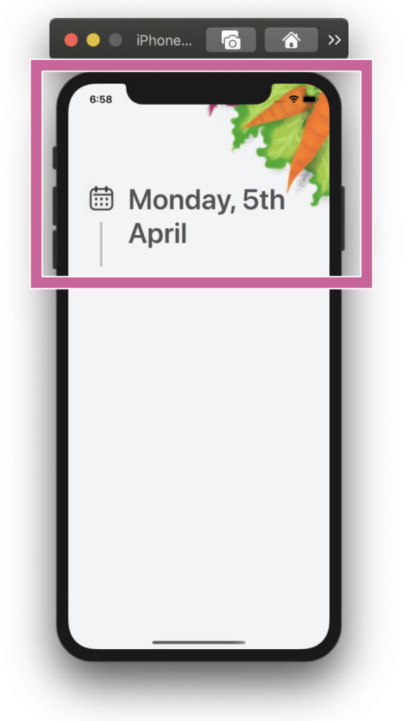 .
.Let’s start! In this section we will be working with the “Welcome wall” block and to replicate it we just need to add the following parts:
.
➖ Schedule timeline
➖ Date description
➖ Corner image
.
Defining the main structure: To start developing the complete design structure that will contain our first screen I will use a Grid.
.
.
.
In your ContentPage header, add the following line:
.
Once we create the main structure, let’s go step by step, to build the first block.
.
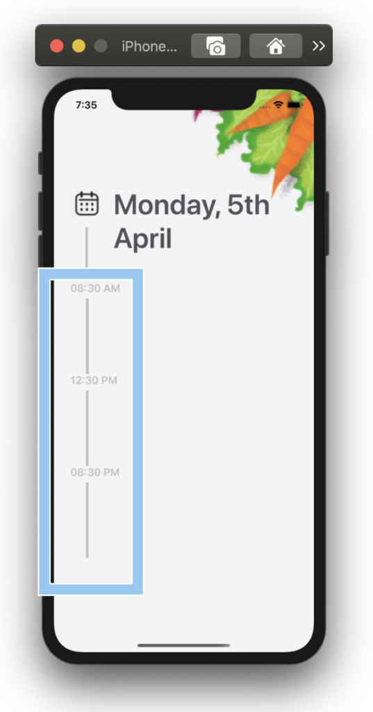
Let’s continue with our next block named Schedule timeline. Here we will be using a CollectionView. It’s important that the project adheres to the MVVM Design pattern. That’s why I used text properties Binded.
In a previous article before building the UI of my application, I made a post explaining how I made the structure of MVVM, if you are a beginner it could be very useful for you! I leave you the link in case you want to take a look
here!
As it is a simple interface, the content within the list will also be divided into blocks, for this reason we will start with the timeline!
.
.
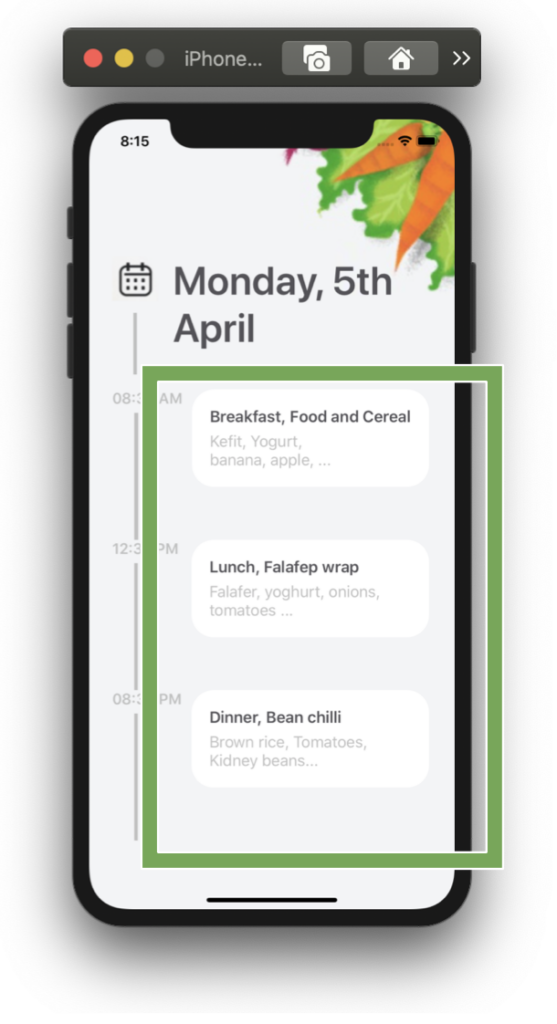
So, Let’s continue with the “Card block”. To build it we just need to use a Frame to get the main shape and add two labels inside!
.

.
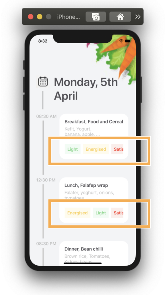
Finally, let’s add the Feature list block! Here I used a CollectionView too but this time horizontally!
.
.
.
And our Schedule design is done! ?.

To see the complete code structure you can enter to my Github repository

.
.
.
Tagged AskXammy, Replicating UI, Xamarin Forms


 .
.



Thanks for the example of a Schedule.
Looks good
You’re welcome dear! 😊