

Howdy! 💁♀️ I am thrilled to share my article for the .NET MAUI UI July 2023 calendar created by Matt Goldman, during the month of July, this calendar will publish various educational contributions created by industry experts about .NET MAUI. In this article, I will guide you step-by-step in building the Uber Delivery screen in a simple way. Let’s get started!
 Before starting, to get the best out of the post, I’ll leave you some instructional notes so that you have a better experience reproducing the UI:
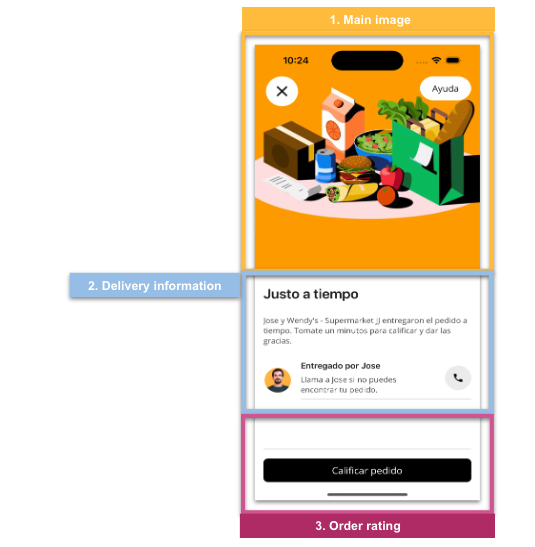
 At the beginning, you will see an image with the original UI where you will see divided into blocks as we’ll be working on each part of the design.
Each block presents the image with the design explicitly that we’ll be working on that block, they are highlighted in a box.
In each of the code blocks, you can see a comment that says: “Here add the code that is being explained in the next block“. To keep you as focused as possible, this part indicates to you that the next block code explanation goes right where the comment line is added.
I will not be using styles so that the properties added to the various components can be seen and understood faster in the explanation process.
Let’s start!
Let’s divide the original design into blocks
To better understand, I have divided the original design into blocks, which are listed in the order in which we will be reproducing each one, these are:
First, let’s define the main layout we’ll be using!
In this case, we will use a Grid to structure the screen as you can see in the following code block:

Let’s begin with the “Main image” block. To better understand the explanation, we will develop each element of this block individually. The following are the elements:
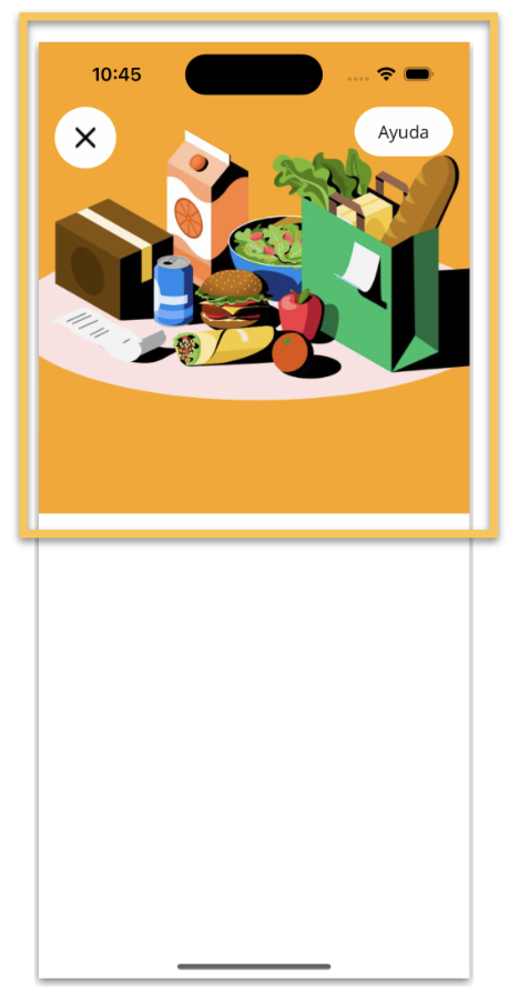
➖ Image: To begin, we will incorporate the food image with a colored background, which will be directly assigned to the Image control itself. Follow the steps below to do so.
➖ Close Button: Above the previously added image, in the upper left corner, we inserted a circular button. This button has a very important feature: its circular shape.
To achieve a circular shape, you can set the WidthRequest and HeightRequest properties to the same value, and then set the CornerRadius property to half of that value. For more details on how to create circular buttons, we recommend reading the article “Easy way to create a circular button.”

Let’s continue with the “Delivery Information” block, this one is made up of the following elements:
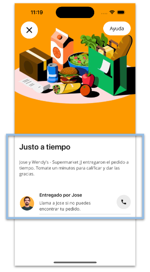
➖Delivery title and description:
➖Profile image: This is a rounded image, achieved using the AvatarView from the .NET MAUI Community Toolkit. For more details on how to implement it, please refer to this article.
➖ Delivery instructions:
➖ Call button: Use the same technique explained in the previous rounded button.
➖ Separator line: In this case, I used a BoxView to create the line, but you can also use the .NET MAUI line shape.

Finally, we just need to add two elements to complete this block: a divider line and a button to rate the order. You can implement this as shown below:
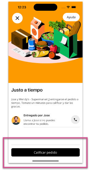
And our Uber Delivery UI is done!  .
.
Thanks for ready! 👋 See you next time! 💚💕


1 thought on “Replicating Uber Delivery UI in .NET MAUI”