

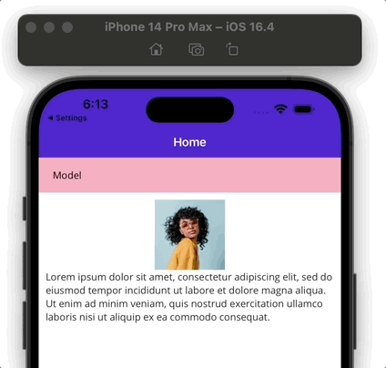
Imagine designing a user interface filled with distinct elements, each boasting its unique header and intricate details. To achieve a streamlined visual layout and save space, consider displaying only the headers and revealing the details upon selection. With the Expander control from the .NET MAUI Community Toolkit, this vision is entirely attainable. Join me, and I’ll guide you step-by-step to a implementation. 💕
The explanation will be divided into the following points:
🔹 .NET MAUI Community Toolkit: Implementation
🔹 What is a Expander?
🔹 How to implement it?
🔧 First of all… What do I need to know?
What is .NET MAUI Community Toolkit??
- It’s a collection of reusable elements such as animations, behaviors converters, among others, for developing applications for iOS, Android, macOS and WinUI using MAUI.
🔧 Still haven't implemented it? Check it here!
- Add from NuGet Package: Community.Toolkit.Maui

- Now let’s initialize: Go to your MauiProgram.cs file
In the CreateMauiApp method, place in the .UseMauiApp<App>() line and just below it add the following line of code:
⚠ Don’t forget to add the using CommunityToolkit.Maui;at the top of the class.
- Finally, add the following namespace:
Let’s start!
What is a Expander?
The Expander serves as an expandable container which is composed of a header (the content visible before expansion) and a container, designed to hold the detailed content linked to each header.
How to implement it?
In order to show the Expander on screen, you must utilize two elements: The Header and The Content. Each one of these includes specific properties that help in the Expander configuration.
Let’s see a preview of what the structure should be like, and consequently we will start detailing the explanation.
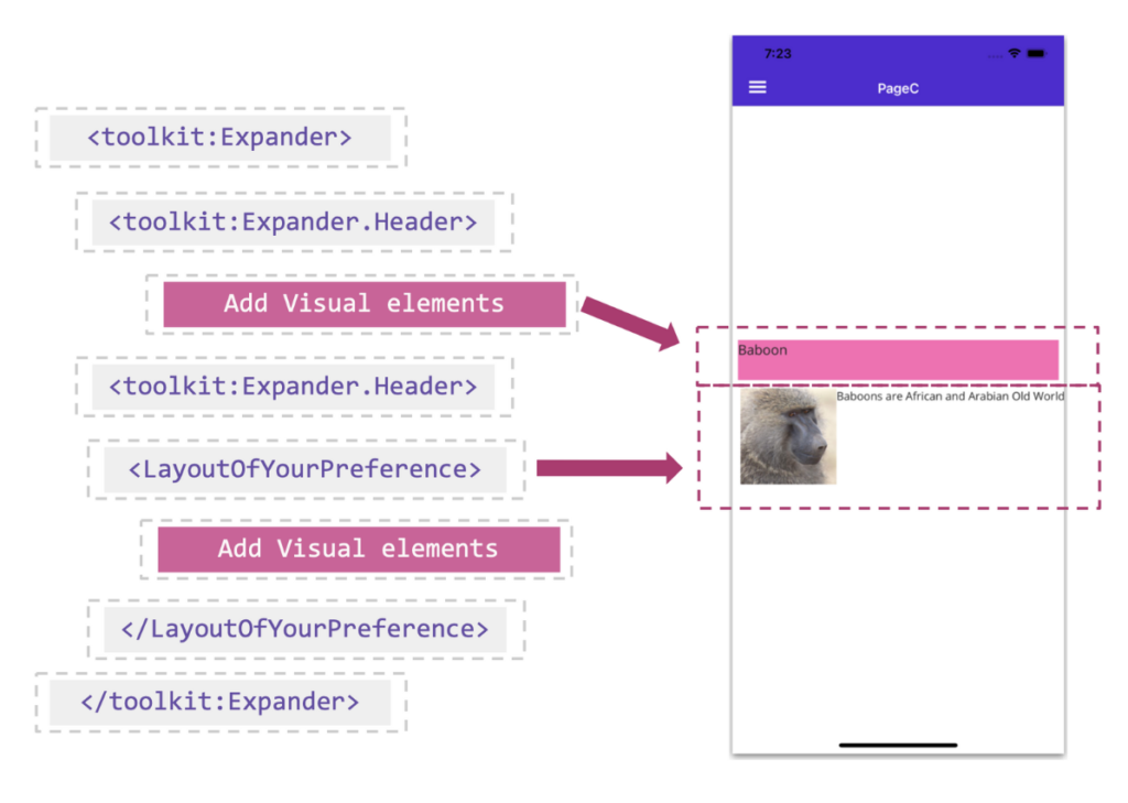
However, before delving into incorporating the two previously mentioned elements, it is important to add the tags that will house them. To establish this foundation, you simply need to integrate the following tags provided below:
🔹 Header
The header remains constantly in view, and a simple click or tap will expand or hide the content. Ensure you populate it with read-only material, steering clear of controls demanding further user engagement.
Exactly where it says <!-- The Header element goes here--> in the previous block, add the <Expander.Header> tags, here you can add all the visual elements you need, for this example I have only added a Label.
🔹 Content
The content is what the user will see when interacting with the header, fluidly alternating between its visibility and hiding each time the header is selected.
The integration is intuitive and you do not need additional tags. Once you’ve set your header tags, simply add an element to hold the detailed content. For this example I will use the VerticalStackLayout, within the layout I can add all the visual elements I need.
🚫 Limitations
➖ Expander does not support ListView on iOS/MacCatalyst.
And done! 😎 From now on, you are ready to use Expander in your .NET MAUI applications! 💚💕
<Label Text=”Thanks for reading! 👋 ” />
Spanish post:
References:

2 thoughts on “Exploring the expander from .NET MAUI Community Toolkit”